
Team:
Client: Avalon Hill
Art Director: Samy Ventura
Instructions Designer: Morgan Moscinski
Product Design: Elizabeth Hargrave & Doug Hopkins
Narrative Design: Tess Hogan
Client: Avalon Hill
Art Director: Samy Ventura
Instructions Designer: Morgan Moscinski
Product Design: Elizabeth Hargrave & Doug Hopkins
Narrative Design: Tess Hogan
Brief
To develop a cohesive and elevated visual direction for Sanibel that reflects the warmth, realism, and emotional resonance expected from an Elizabeth Hargrave title—while establishing a distinct identity within both her portfolio and the broader strategy game category.
To develop a cohesive and elevated visual direction for Sanibel that reflects the warmth, realism, and emotional resonance expected from an Elizabeth Hargrave title—while establishing a distinct identity within both her portfolio and the broader strategy game category.
Outcome
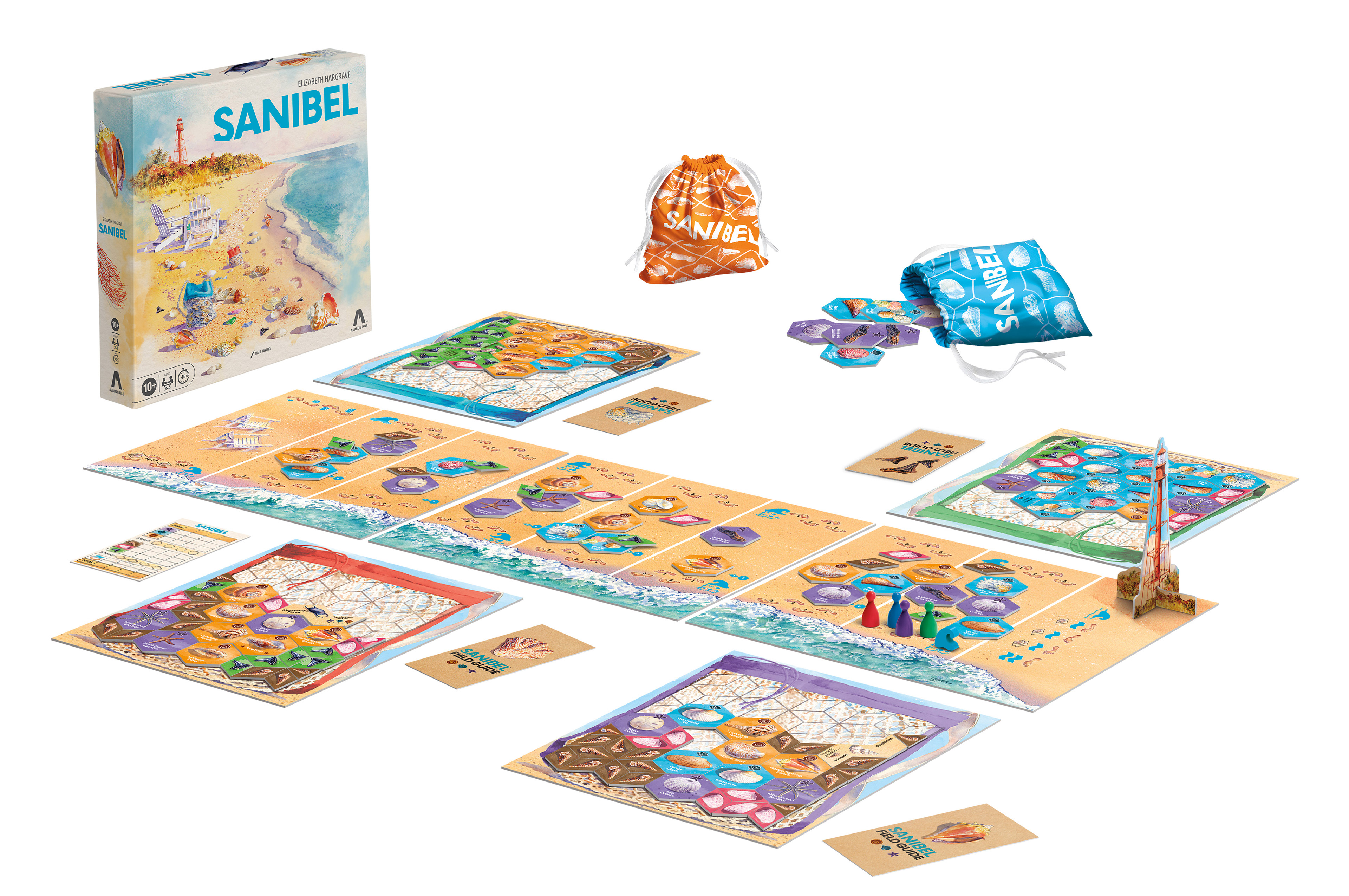
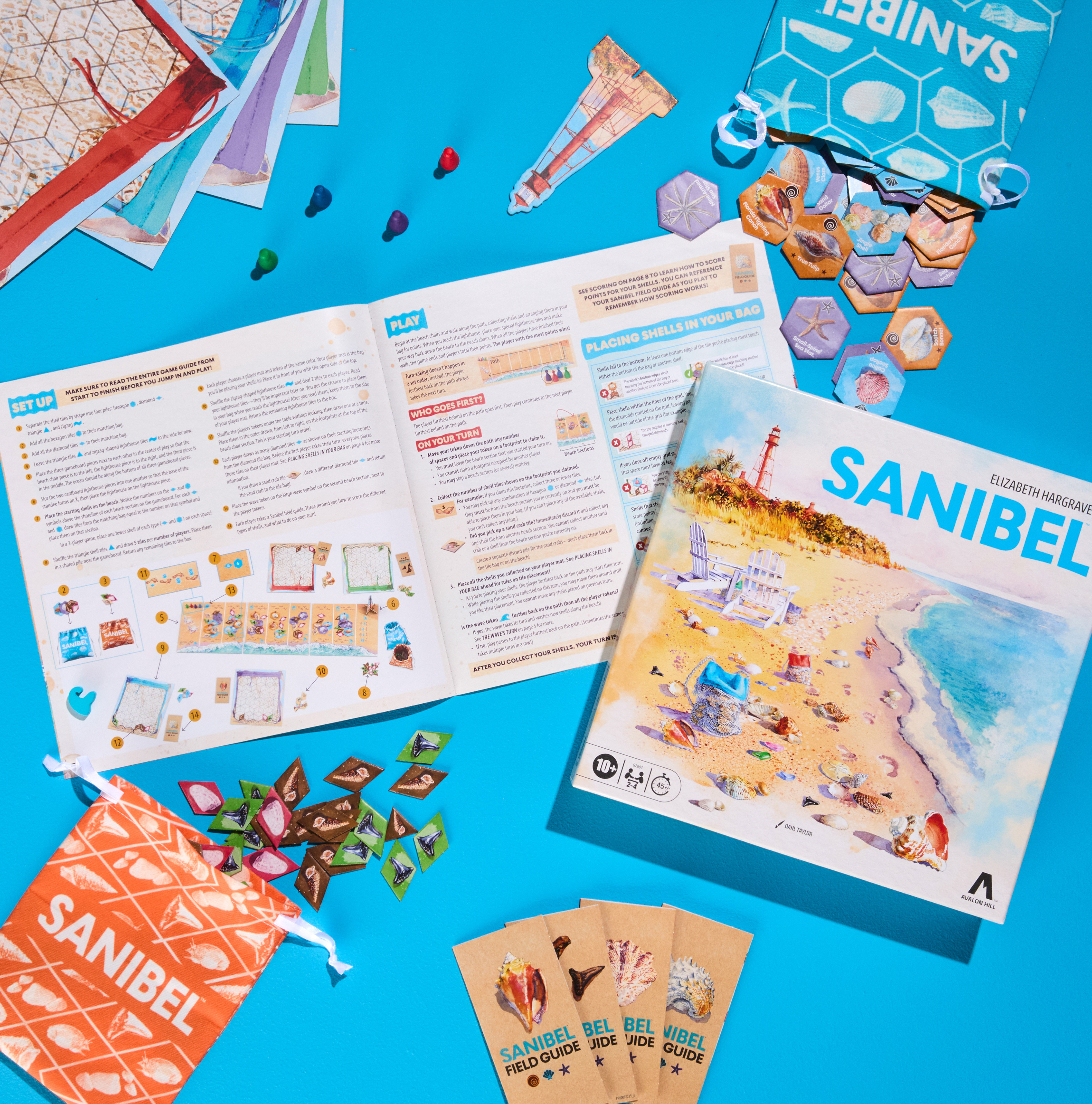
Sanibel is a strategy game that authentically reflects the beauty of Sanibel Island, its mechanics, and the experience of collecting shells on the beach.
“I think we all expected a rousing sales pitch from the Sanibel game team,” SanCap Chamber President and Chief Executive Officer John Lai said. “What we didn’t anticipate was such a sincere, touching, and very concrete tribute to our community.”
Board Game Geek: 7.2, Kovray 8.0, Camilla 7.5 Tom Vasel 7.5, Av Club B+
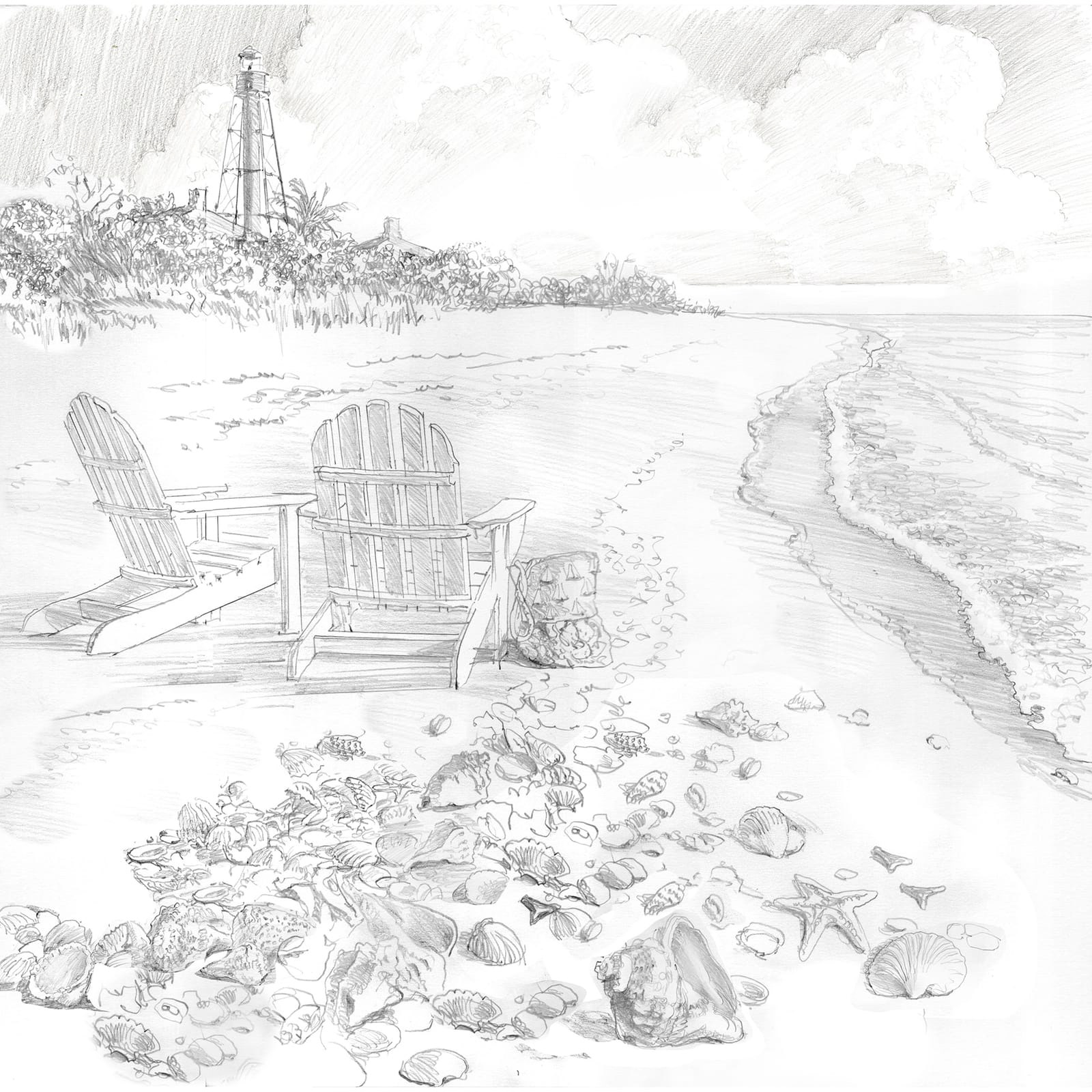
Early Sketch from Dahl Taylor
Process
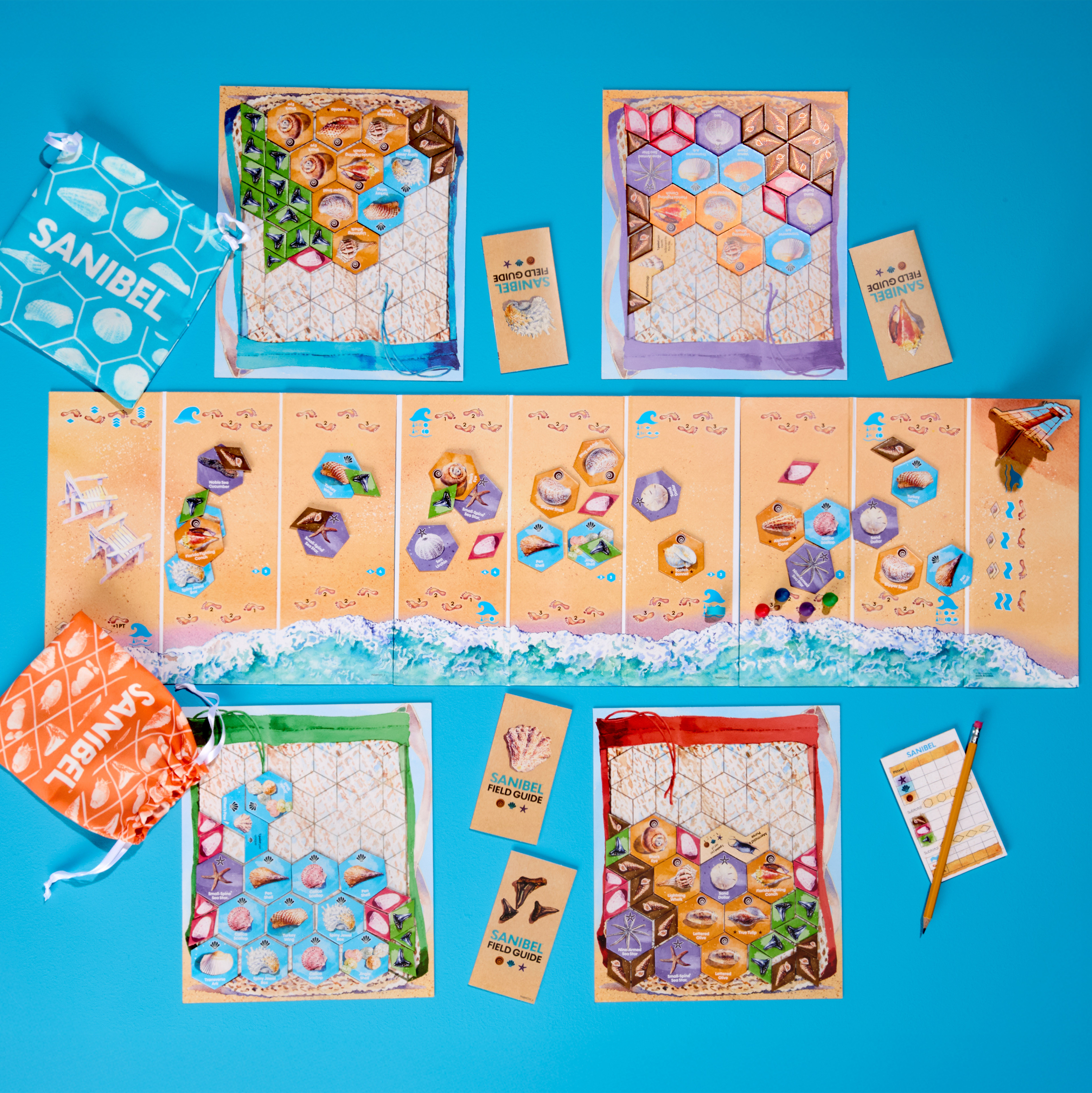
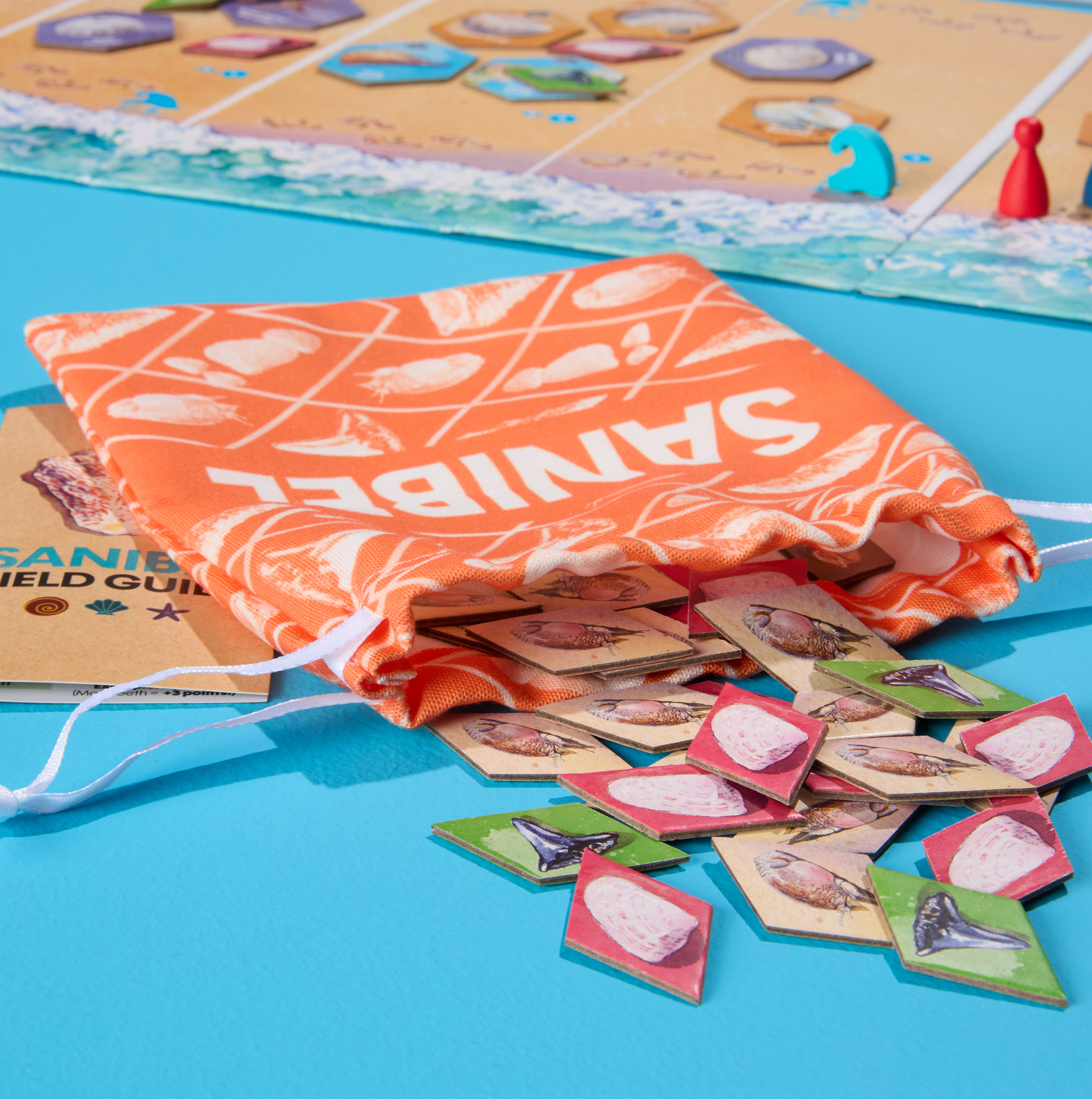
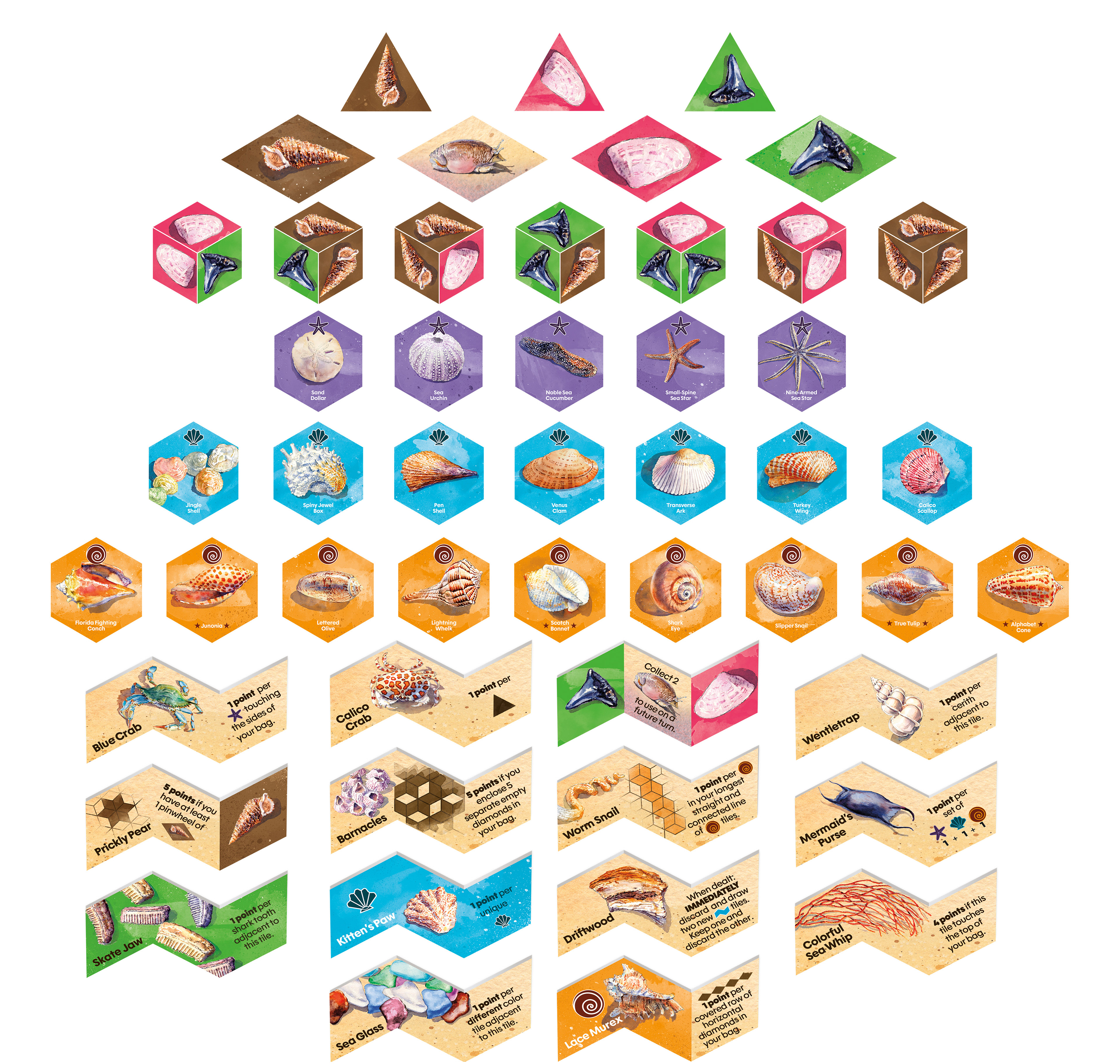
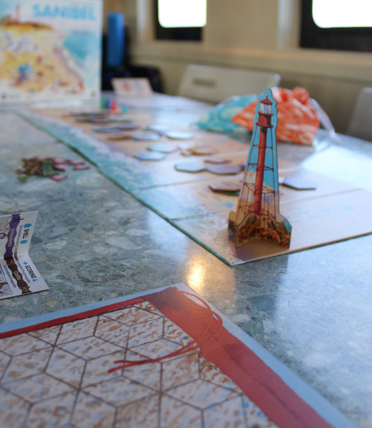
The game is set in Sanibel Island, Florida—a beach known for its abundance of shells and quiet coastal beauty. Sanibel Island has an abundance of seashells due to its unique east-west coast orientation, which acts as a net collecting shells that wash on shore.
The primary goal for the game's art from the beginning was to utilize watercolor, as its organic flow perfectly captures the theme of waves washing shells ashore. I collaborated with watercolor artist Dahl Taylor, whose expertise in maritime illustration brings an authentic and lived-in quality to the Sanibel game. Drawing on insights from other nature-themed games, the art direction emphasizes a sense of coziness and realism, creating an experience that feels both intimate and true to life. This approach aligns with the expectations of Elizabeth Hargrave's audience.
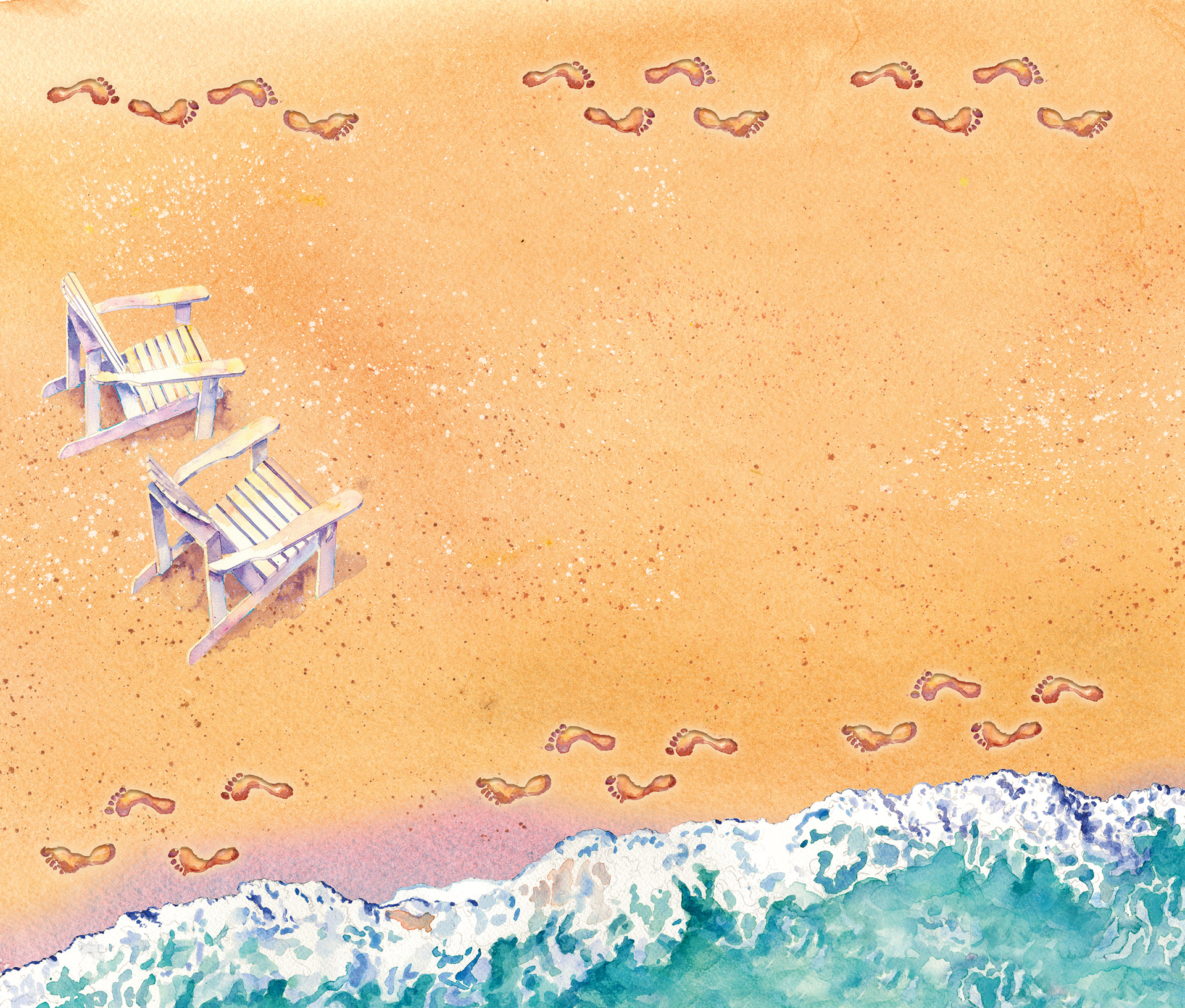
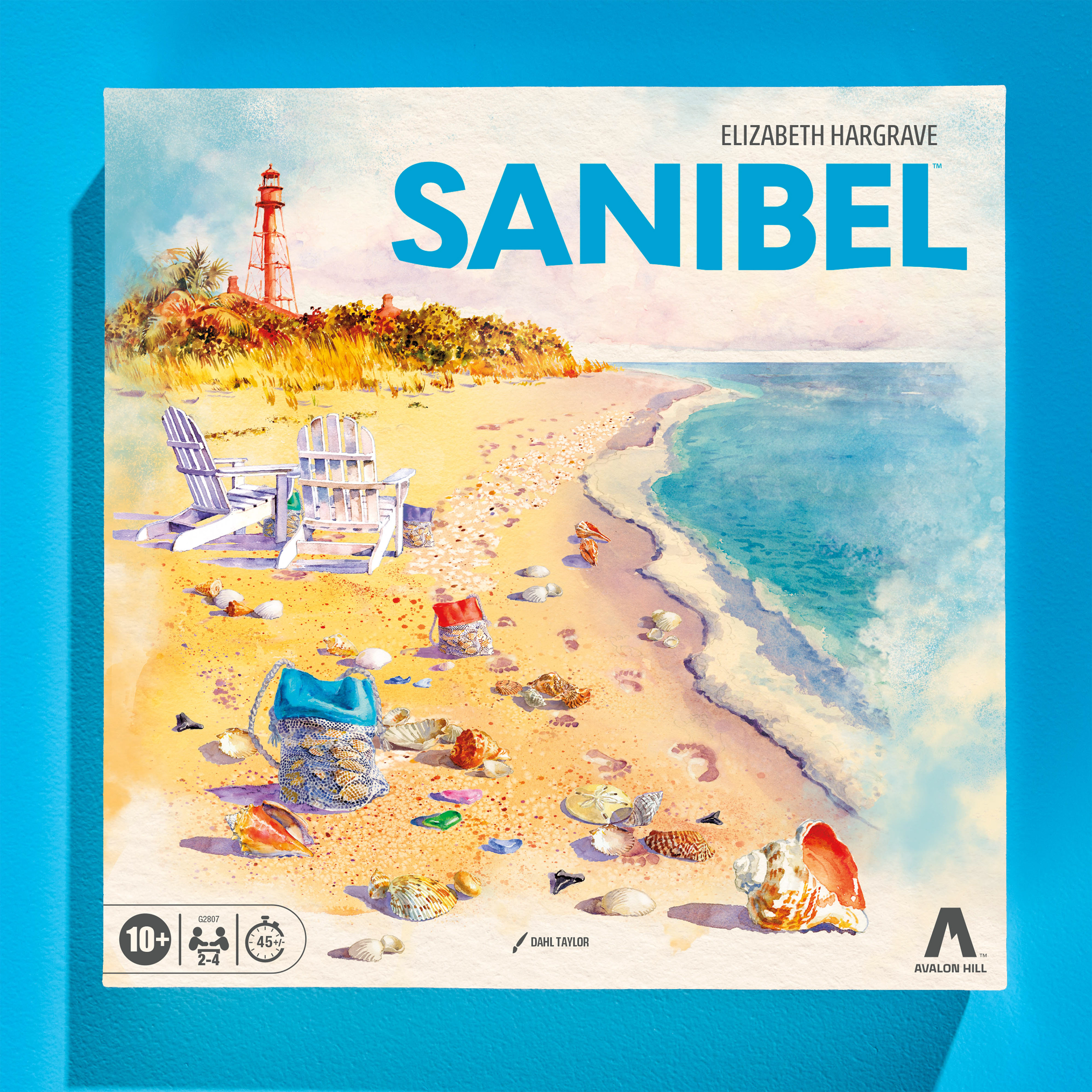
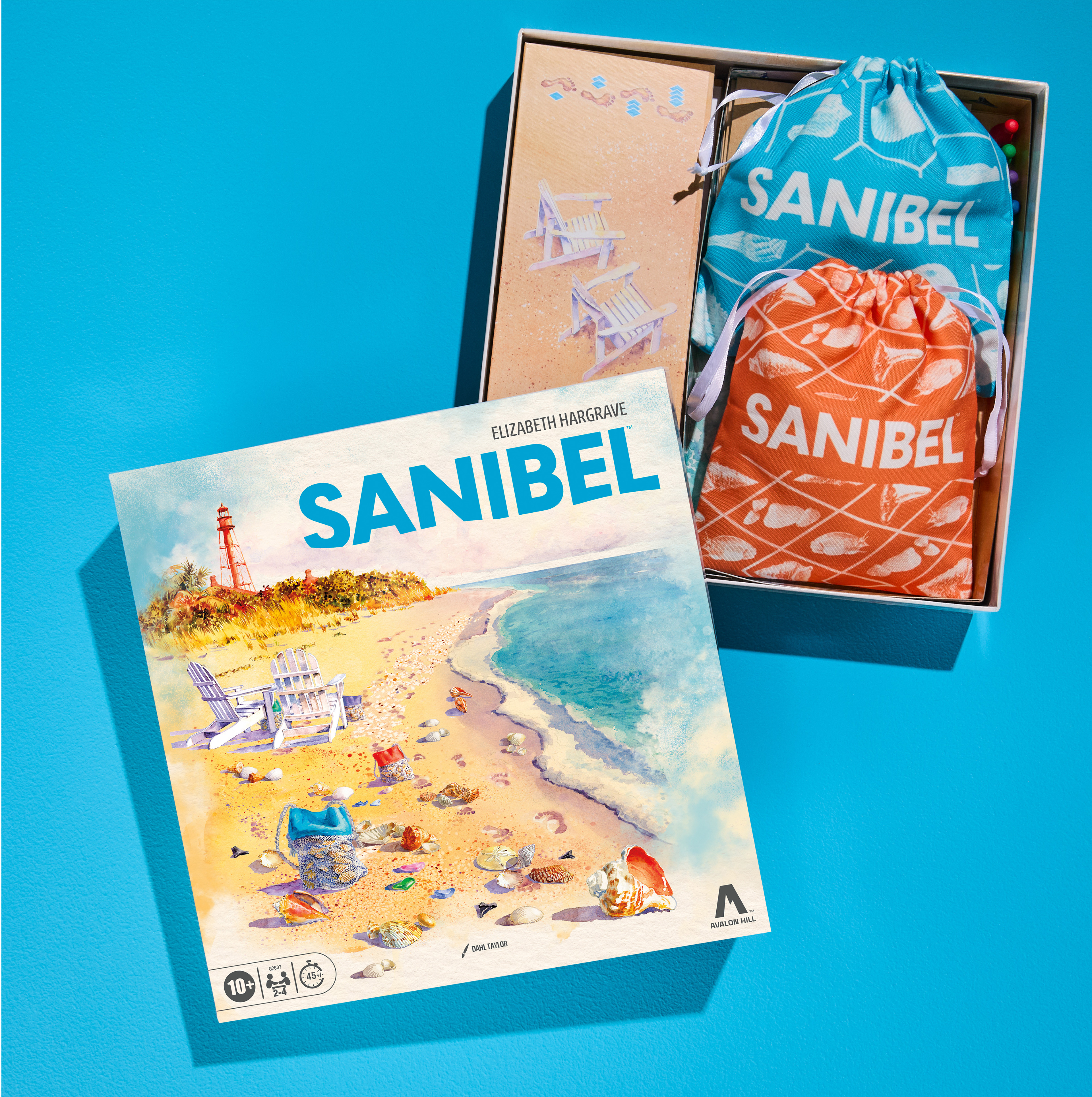
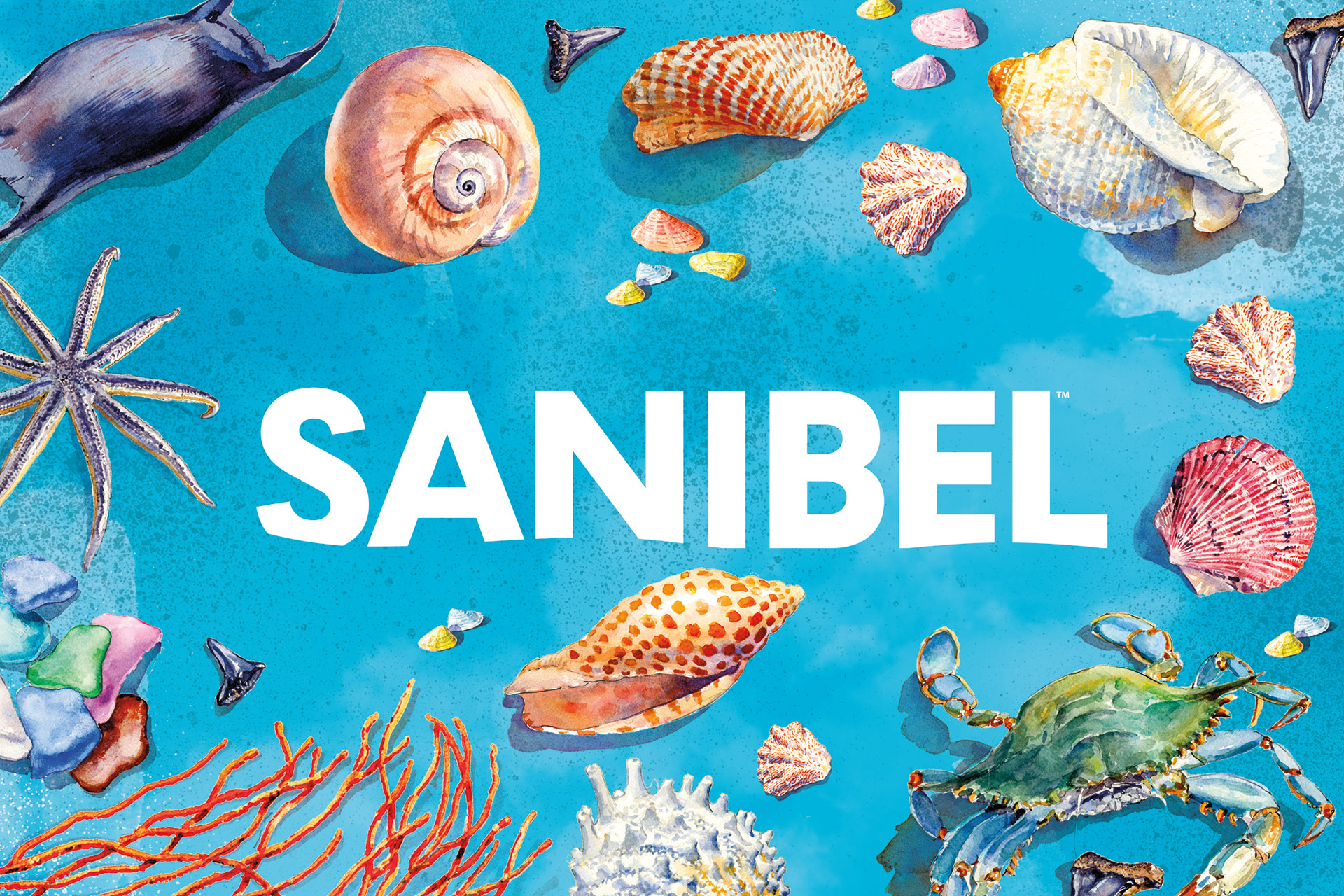
The lighting and tone on the front of the package are designed to evoke early morning, capturing the serene and rewarding experience of shell collecting. With the moon and winds influencing the waves throughout the night, mornings are deemed the best time for successful shelling. A warm color palette enhances this atmosphere and sets the game apart from cooler, more saturated beach-themed titles on the market.
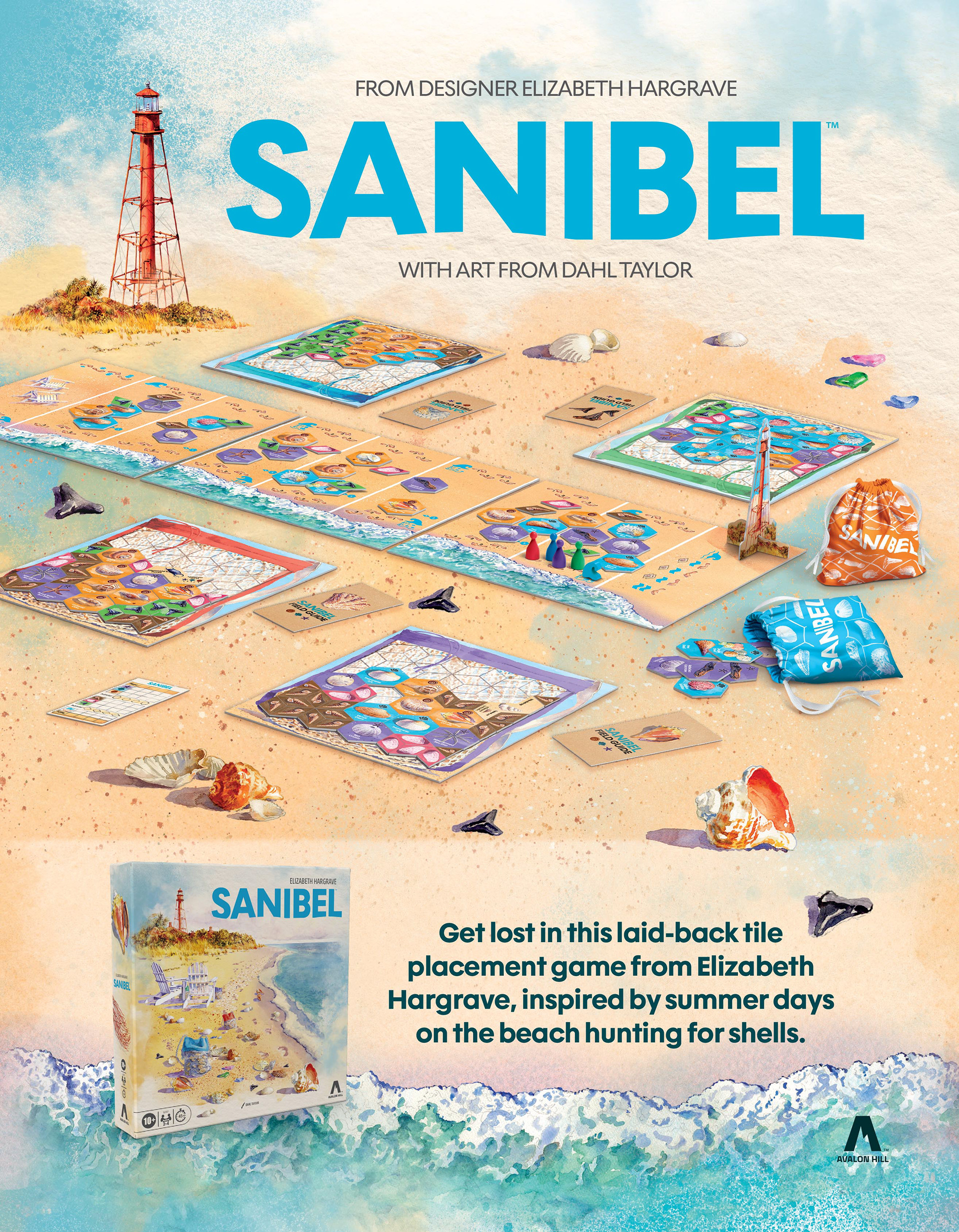
To ensure strong thematic cohesion, the front-of-pack illustration draws directly from the gameplay journey. Players begin on one end of the beach and progress toward the lighthouse—this composition is echoed visually to create a sense of narrative immediacy, placing the consumer directly into the experience. The watercolor treatment extends into the branding system, introducing a sense of organic variation that complements the natural subject matter while adding depth within the strategy game space.
For the logo, the brand direction was to pair the softness of the illustration with a bold, modern typographic approach. This contrast is designed to elevate the overall presentation—balancing approachability with contemporary clarity. Subtle visual cues, such as wave-inspired forms, reinforce the core theme of shells being carried ashore.
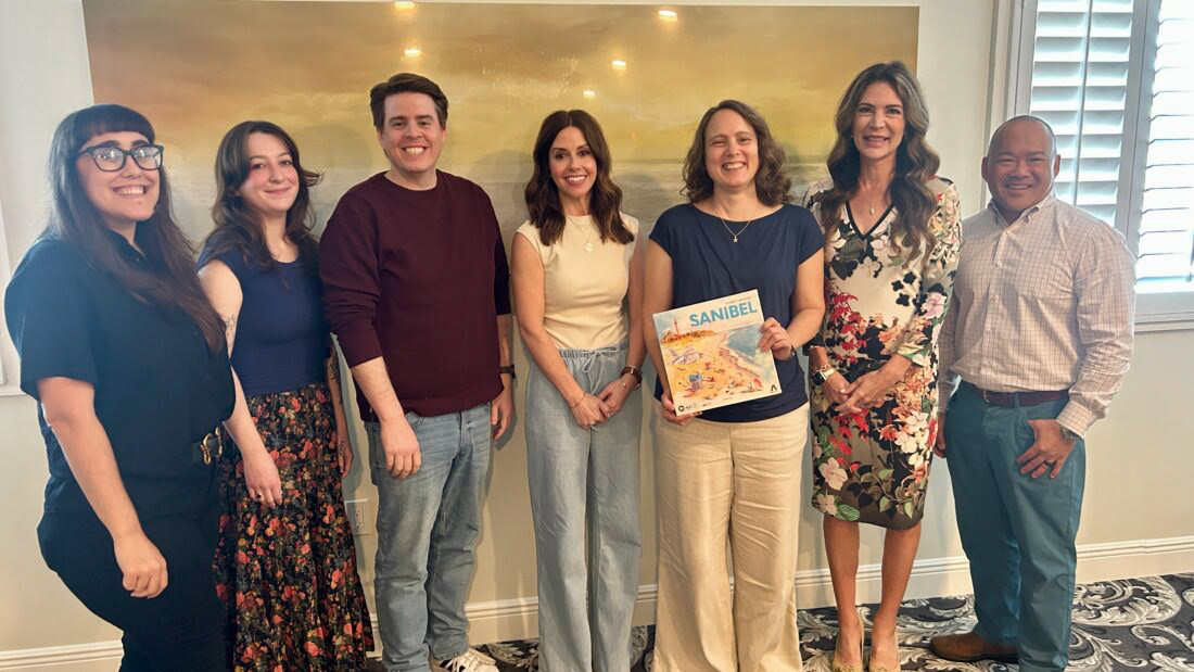
The SanCap Chamber held its business luncheon meeting on Dec. 10 2025 at the Sundial Beach Resort & Spa on Sanibel, featuring a guest panel from Avalon Hill games — a division of Hasbro.
Sanibel aligns with Elizabeth Hargrave's broader portfolio by embracing a nature-driven realism while establishing a unique identity through its coastal setting, warmer color palette, and distinct compositional style. This approach results in a product that feels like a natural extension of her body of work, yet is also distinct and easily recognizable on the shelf.
Links:
View more work:
Sanibel Branding | Trivial Pursuit Case Study | Avalon Hill | Disney Villains | Hasbro Games Art Direction
PR Kits | Web Design |Fashion Doll Packaging | Event Design | Branding | Unneeded Co | SGPC | Logos
Sanibel Branding | Trivial Pursuit Case Study | Avalon Hill | Disney Villains | Hasbro Games Art Direction
PR Kits | Web Design |Fashion Doll Packaging | Event Design | Branding | Unneeded Co | SGPC | Logos