
Team:
Client: Hasbro Games & CW Network
Art Director: Samy Ventura
Client: Hasbro Games & CW Network
Art Director: Samy Ventura

Image Copyright CW
Brief
To modernize the Trivial Pursuit brand for a CW game show format—evolving its visual identity to feel bold, contemporary, and broadcast-ready, while preserving the heritage elements that make the brand instantly recognizable. The system must deliver distinct, ownable category colors and iconography, with graphics that are dynamic and legible on television.
To modernize the Trivial Pursuit brand for a CW game show format—evolving its visual identity to feel bold, contemporary, and broadcast-ready, while preserving the heritage elements that make the brand instantly recognizable. The system must deliver distinct, ownable category colors and iconography, with graphics that are dynamic and legible on television.
Process
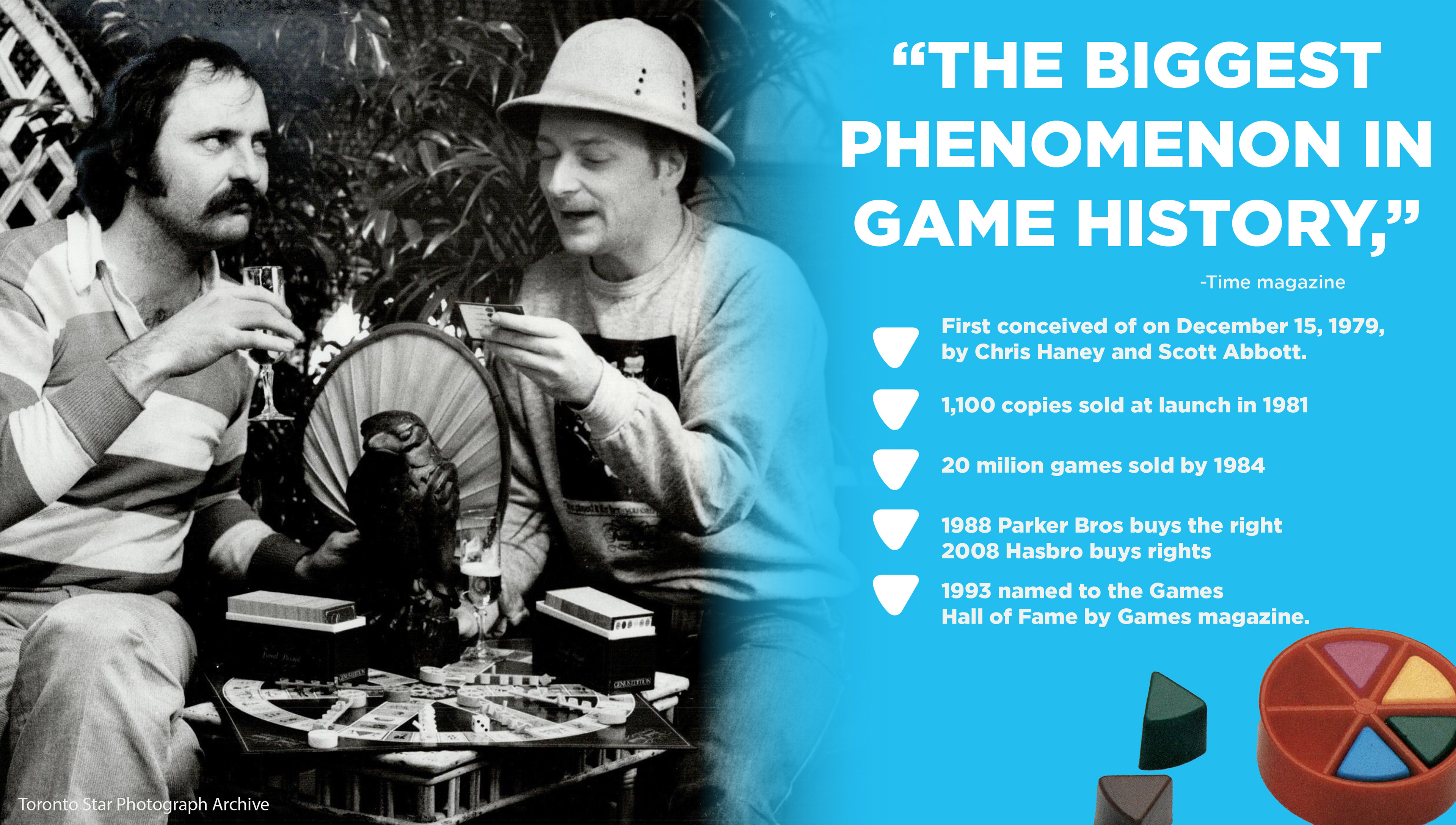
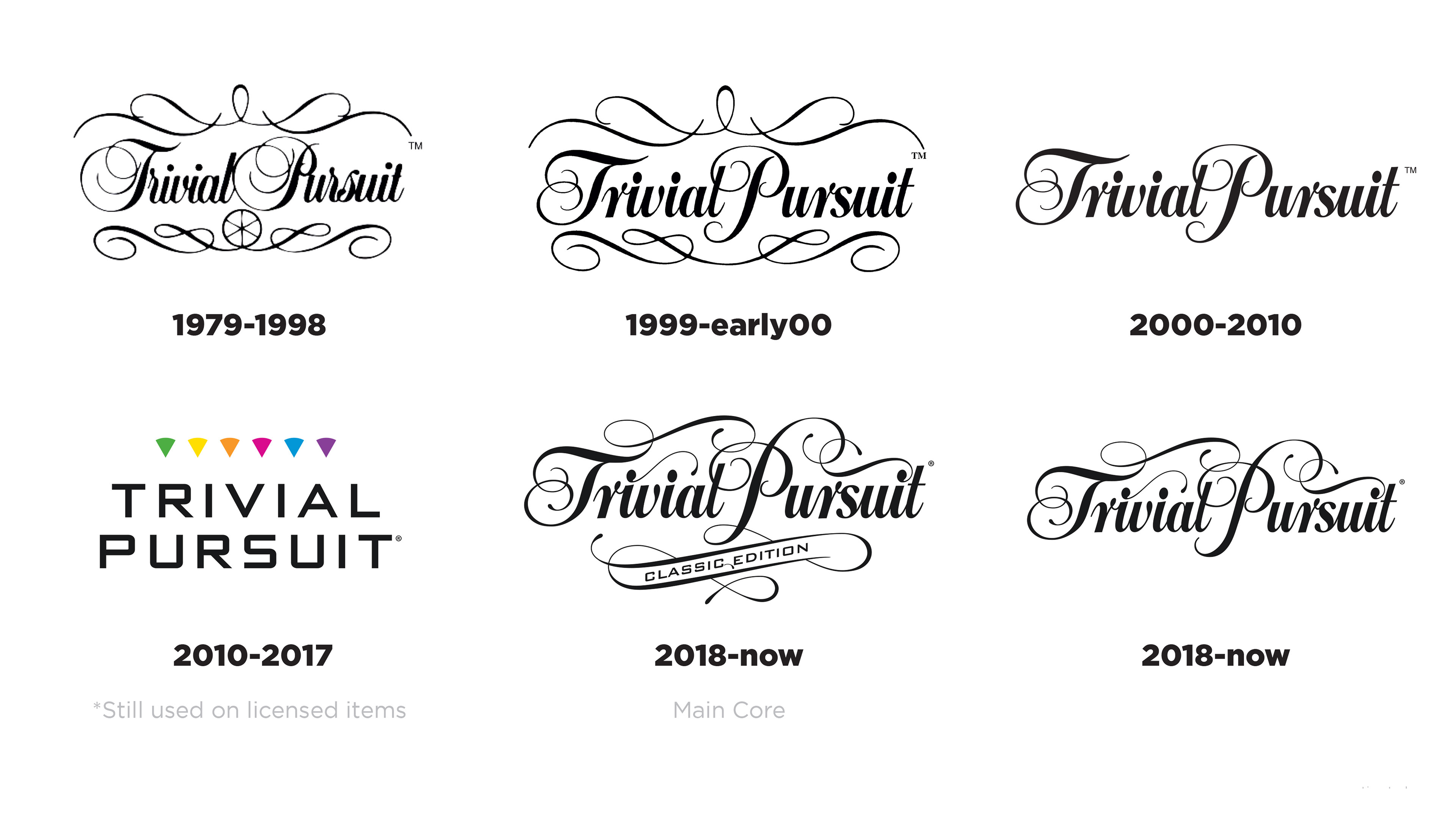
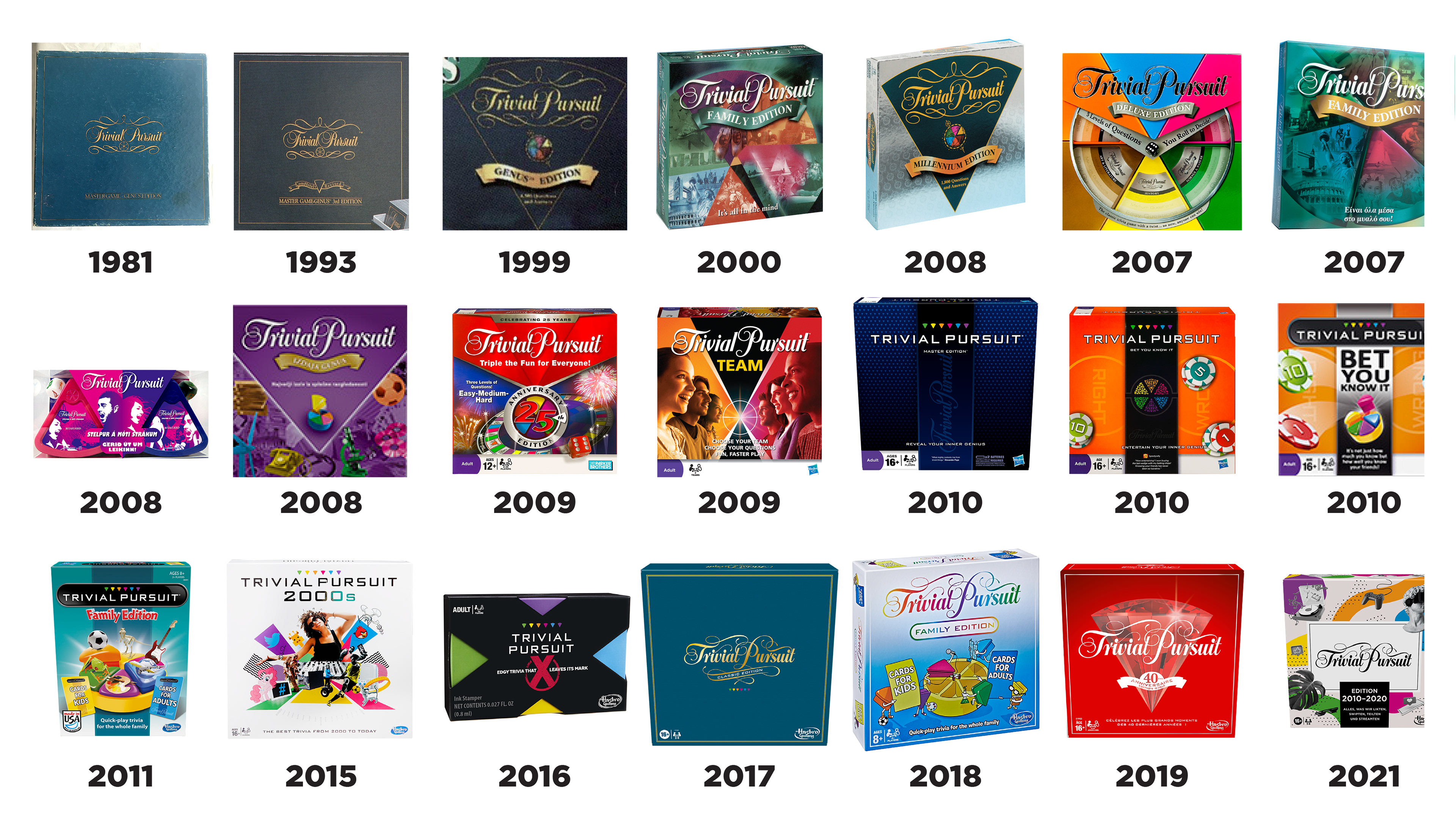
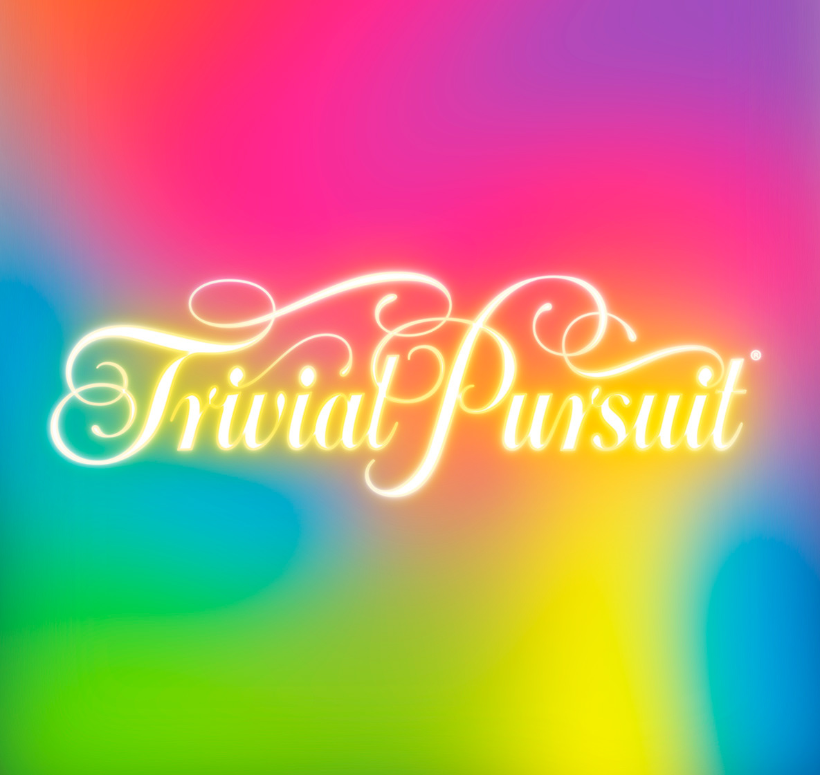
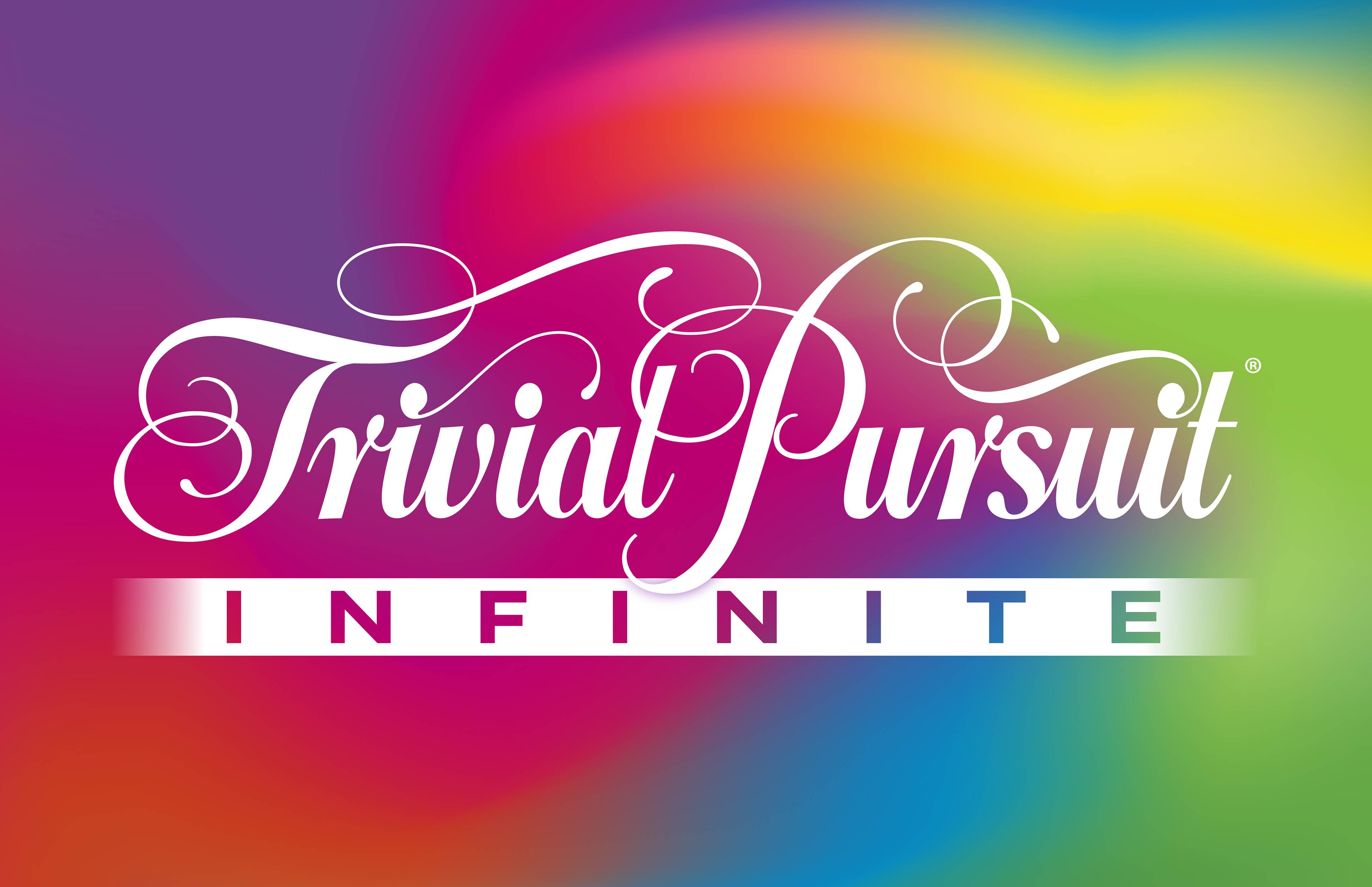
The refresh begins with a deep understanding of Trivial Pursuit’s 40+ year legacy. The brand’s equity—particularly its iconic logo, wedge “pucks,” and radial spoke system—remains central to the visual identity. Rather than reinventing these elements, the approach honors and preserves them, ensuring continuity for long-time fans while creating a foundation for evolution.
The refresh begins with a deep understanding of Trivial Pursuit’s 40+ year legacy. The brand’s equity—particularly its iconic logo, wedge “pucks,” and radial spoke system—remains central to the visual identity. Rather than reinventing these elements, the approach honors and preserves them, ensuring continuity for long-time fans while creating a foundation for evolution.
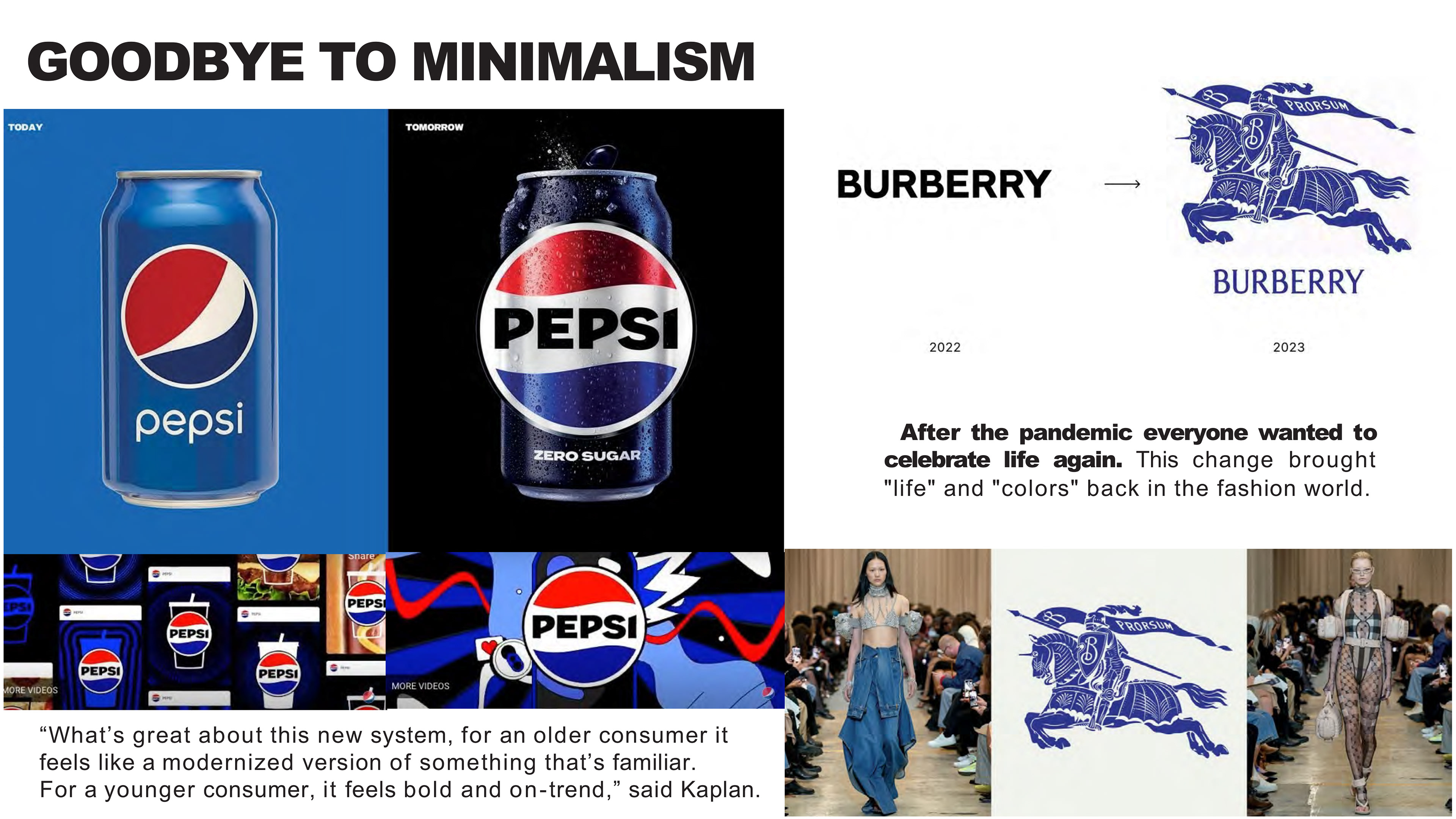
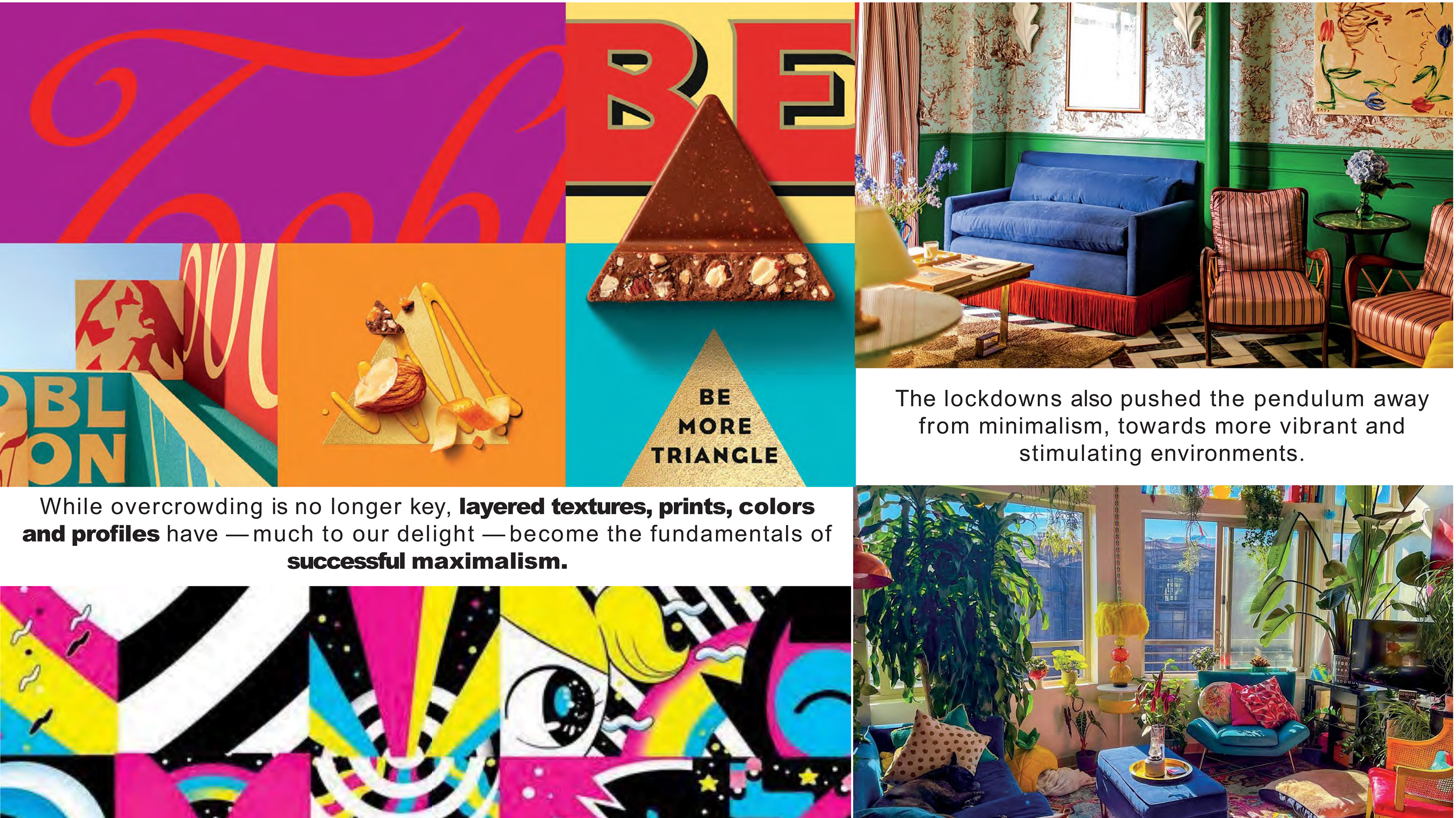
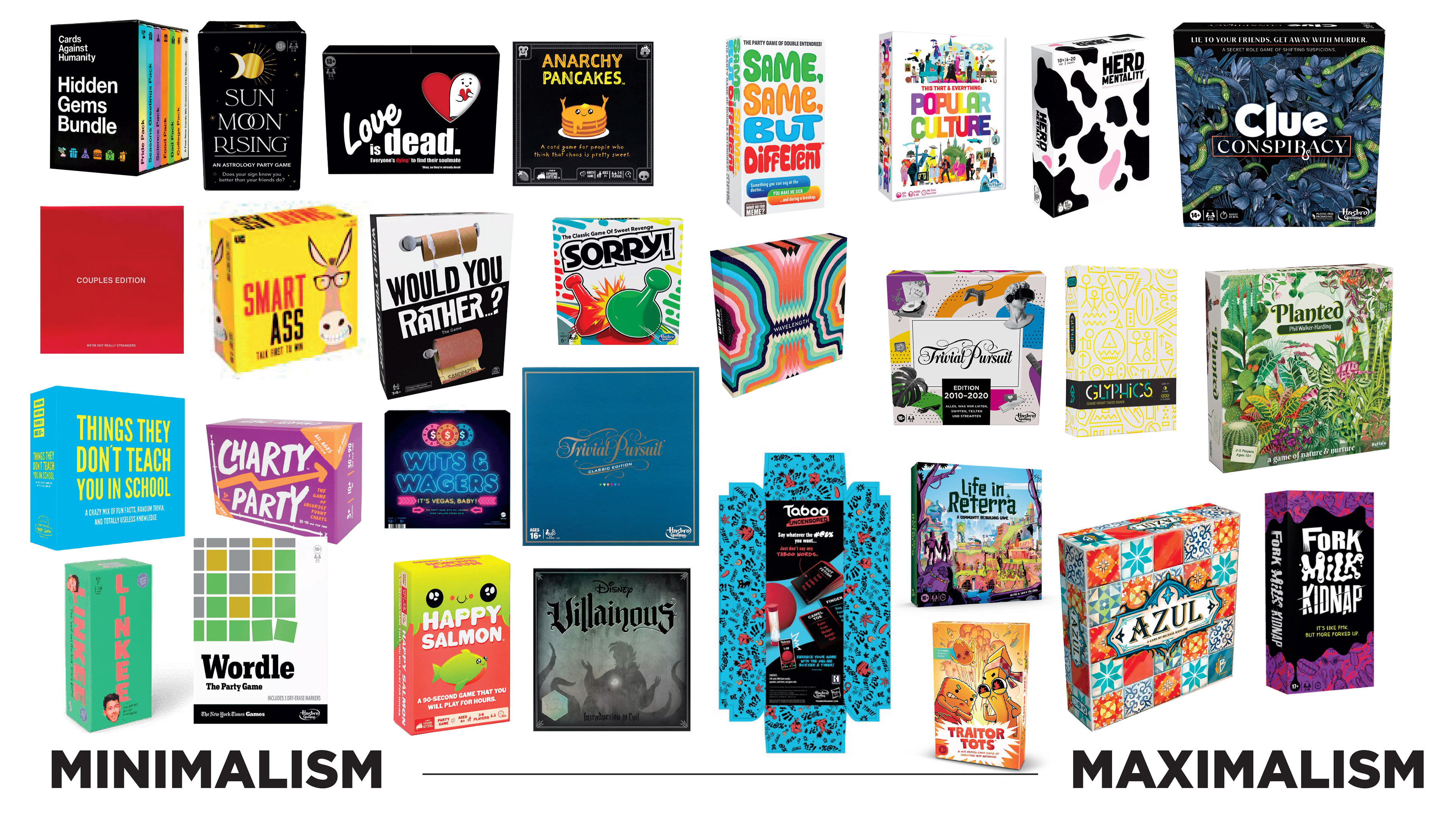
Insights from broader brand research revealed a cultural shift away from minimalism toward a more expressive, layered visual language. Leading heritage brands such as Pepsi and Burberry demonstrate that modernization today is less about simplification and more about amplifying recognizable assets through richness, texture, and energy. This informed a strategic move toward maximalism—not as clutter, but as a controlled vibrancy that balances intensity with clarity.
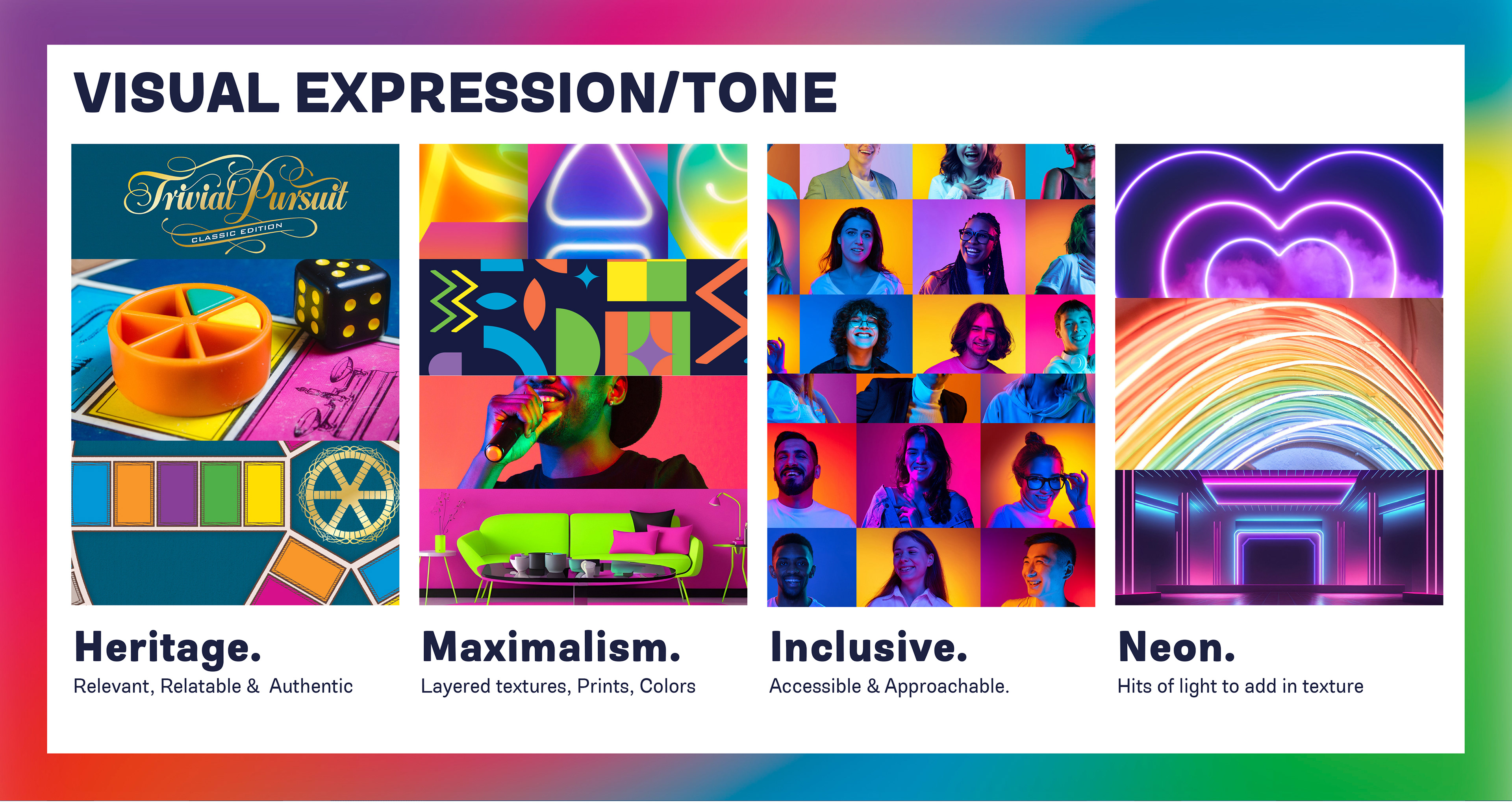
The resulting design system is built across four key pillars:
Heritage – Maintaining the iconic logo and core structural elements to anchor the brand in its legacy
Maximalism – Introducing saturated color, layered graphics, and visual texture to create energy and relevance
Inclusive – Designing a system that feels accessible and engaging, reinforcing that trivia is for everyone
Neon – Establishing a new visual signature through light-based treatments that add depth, dimension, and broadcast appeal
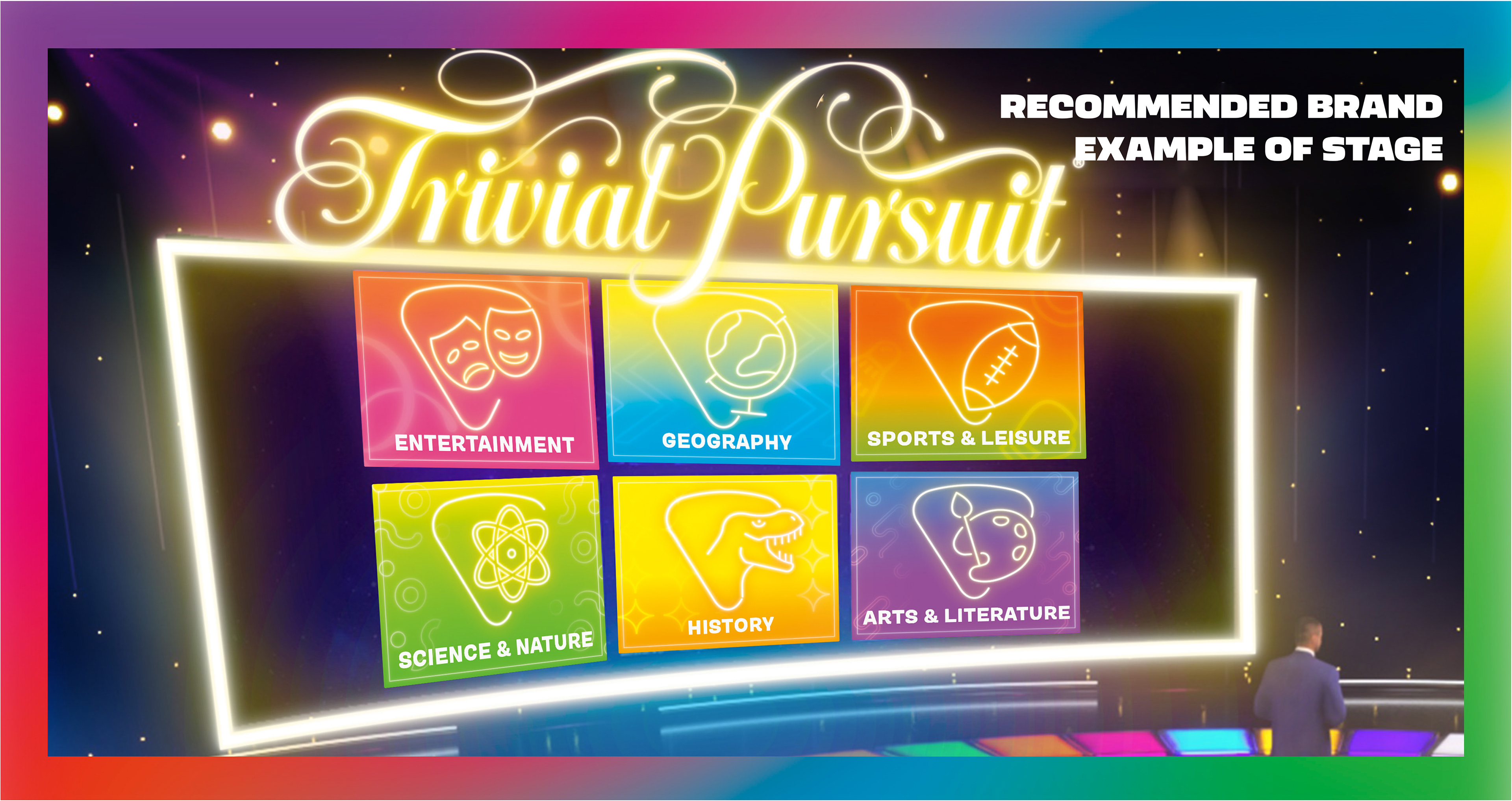
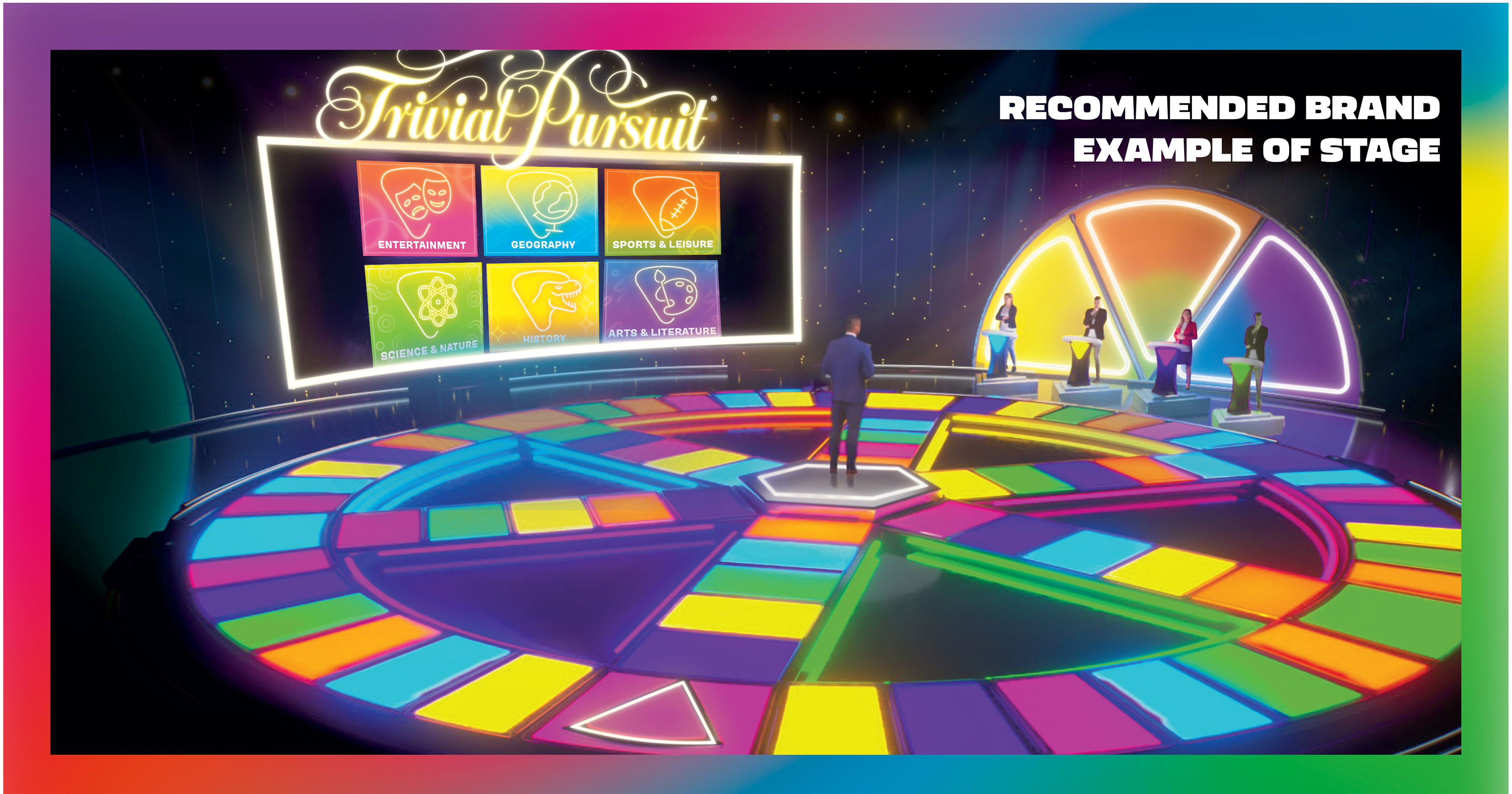
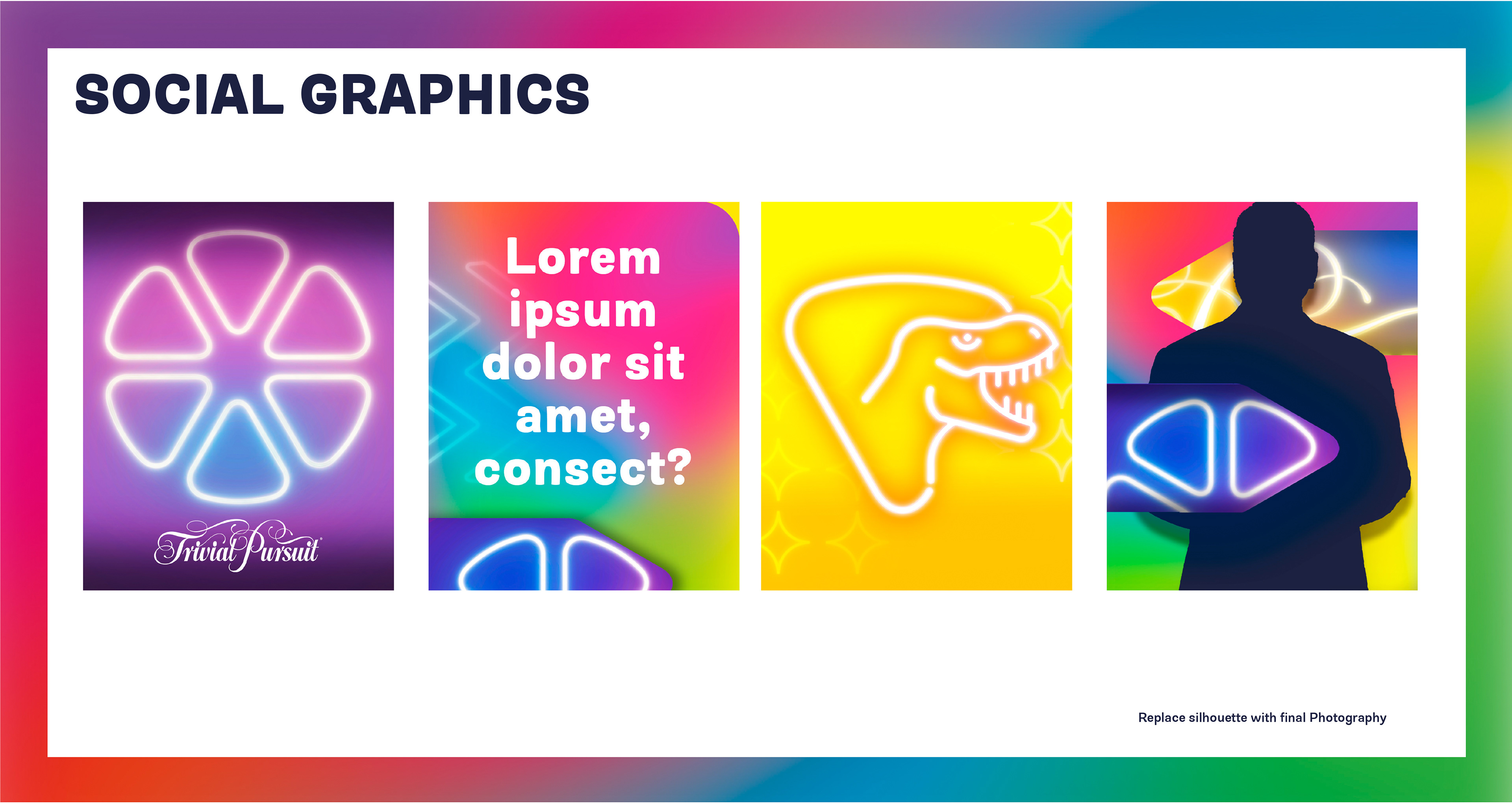
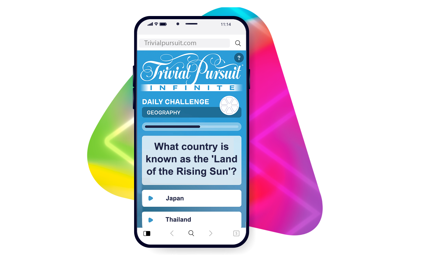
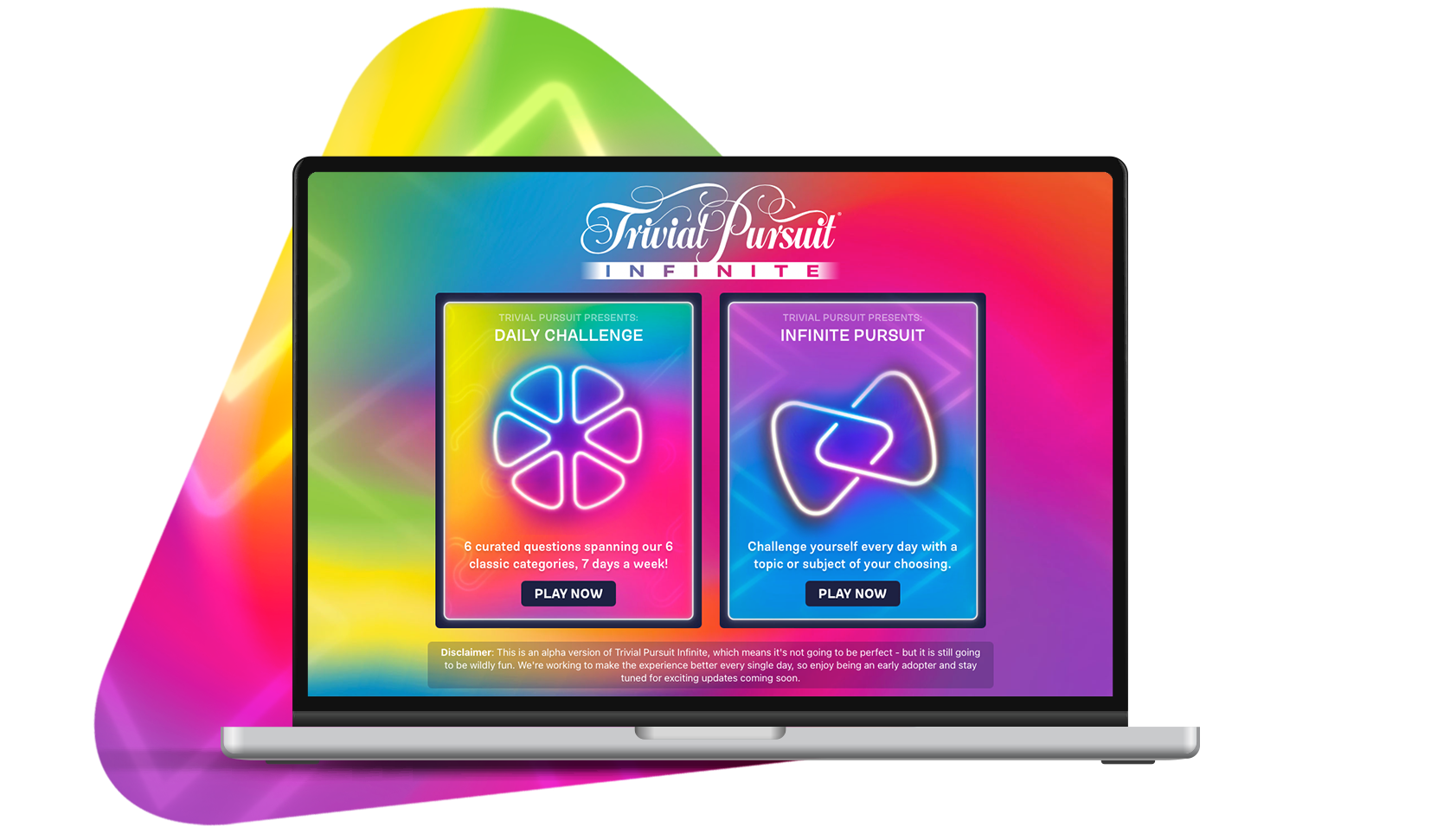
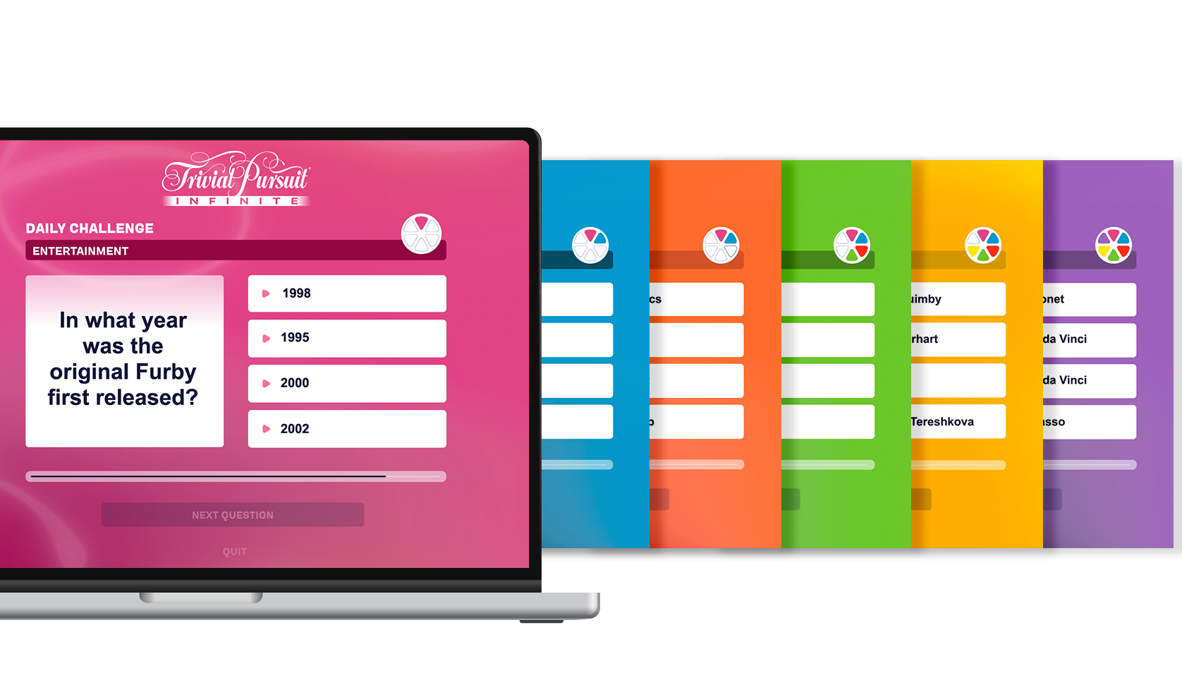
For the CW format, the visual system is designed specifically for screen presentation. Each trivia category features a distinct, bold color and icon, ensuring immediate recognition and clarity during gameplay. These colors are enhanced with neon-inspired treatments and layered gradients, giving them a luminous and impactful appearance on camera.
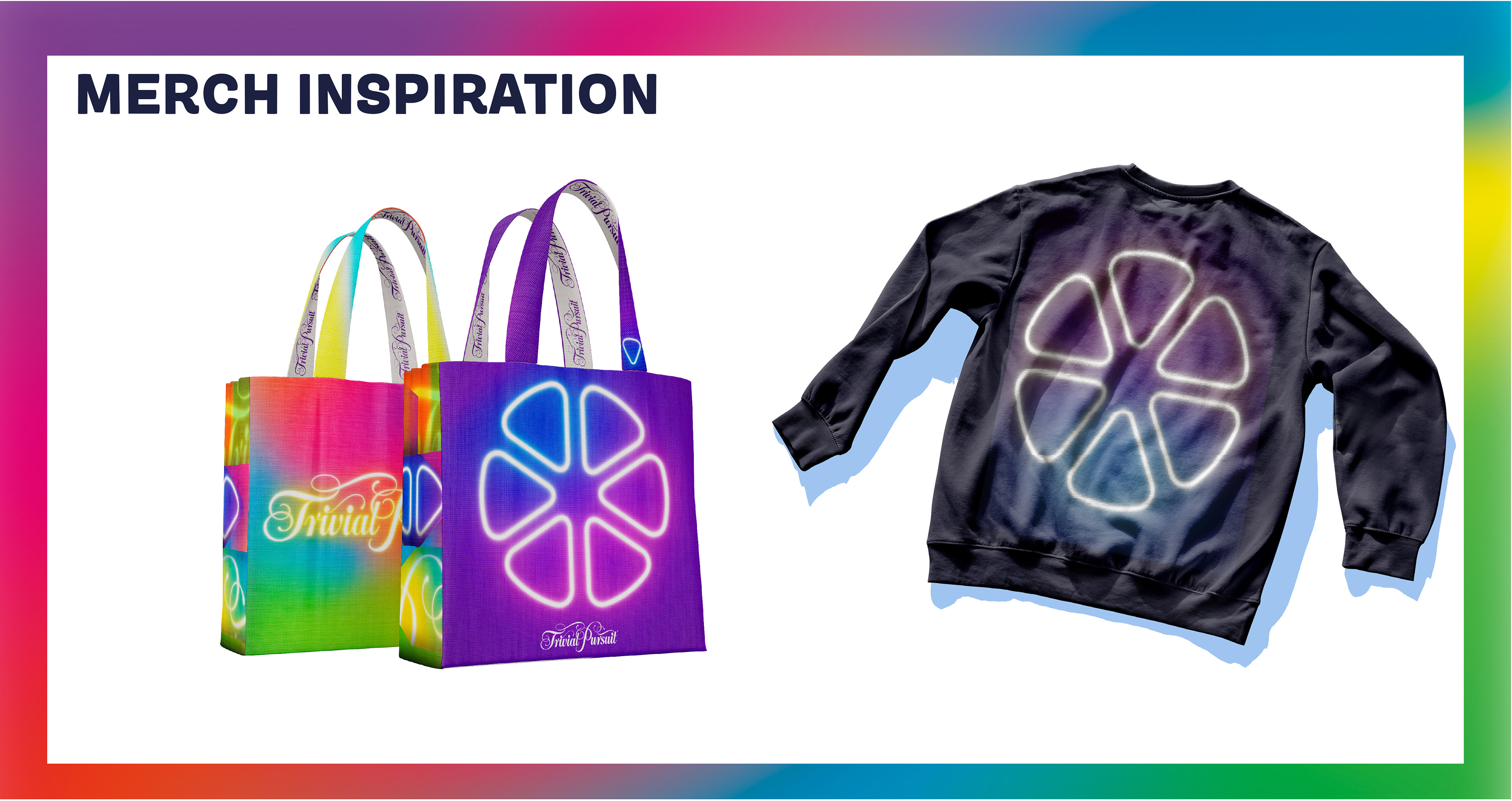
The brand integrates smoothly from broadcast to product. The updated branding unifies the core elements by utilizing consistent colors, iconography, and the recognizable logo to create a strong brand identity. On screen, these principles are applied to motion graphics, category reveals, and user interface moments, resulting in an immersive and visually engaging experience.
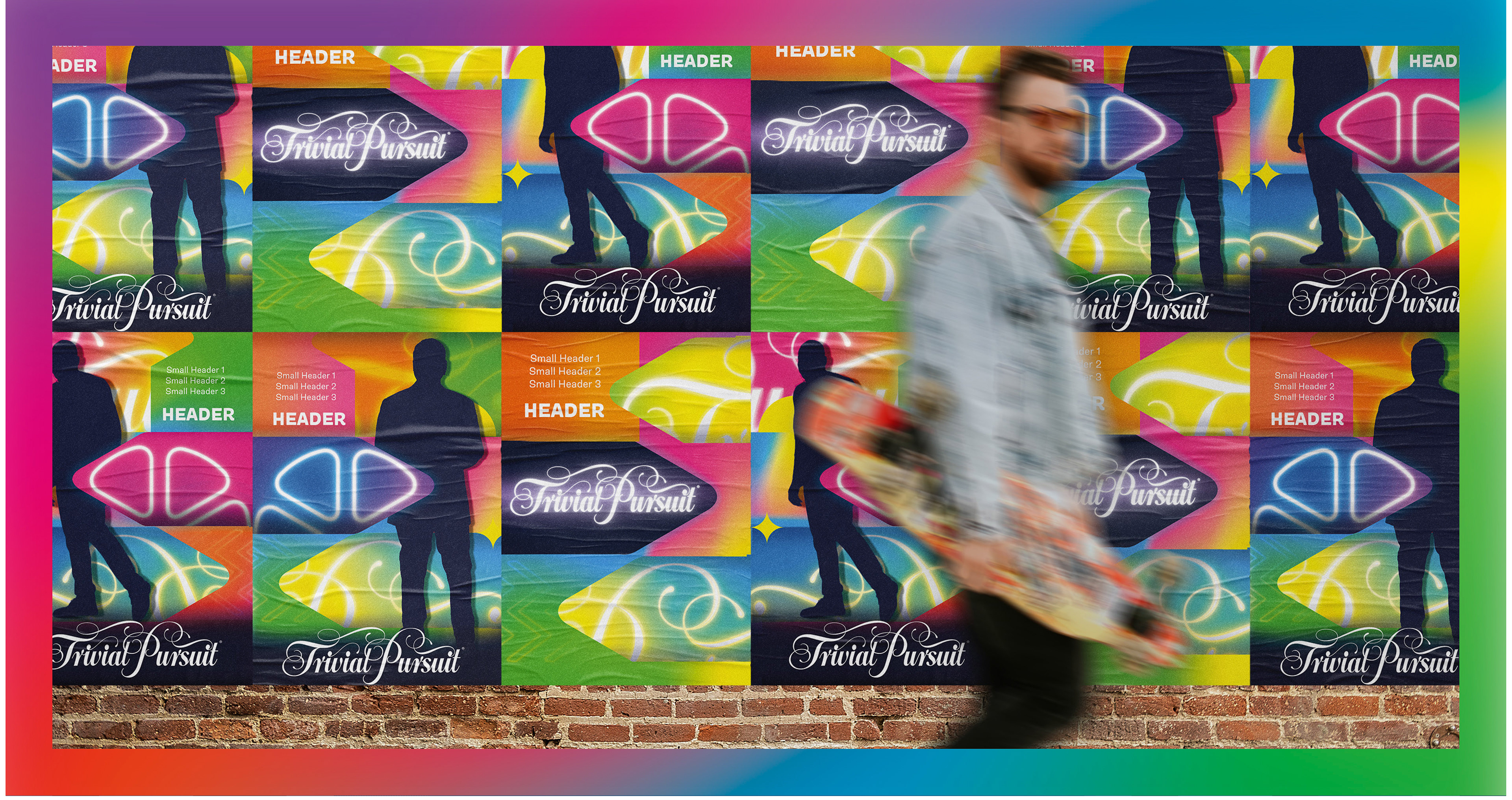
Finally, the branding extends into marketing and show promotion, where layering, color, and light are used to create a sense of excitement and scale. The system is flexible enough to support episodic content while remaining unmistakably Trivial Pursuit.
The result is a brand that feels revitalized and culturally relevant—honoring its legacy while confidently stepping into a more vibrant, entertainment-driven future.
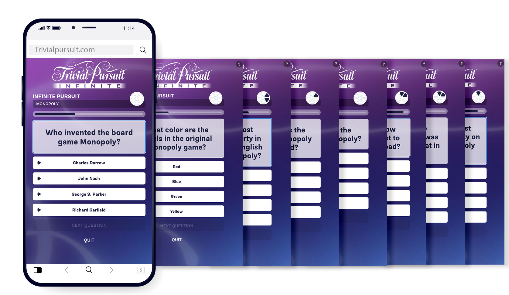
Digital integration, including alignment with the Trivial Pursuit Infinite app, ensures consistency across touchpoints. Close-up UI elements, such as category screens, are designed with clarity and contrast in mind—balancing the richness of the new visual language with functional readability.
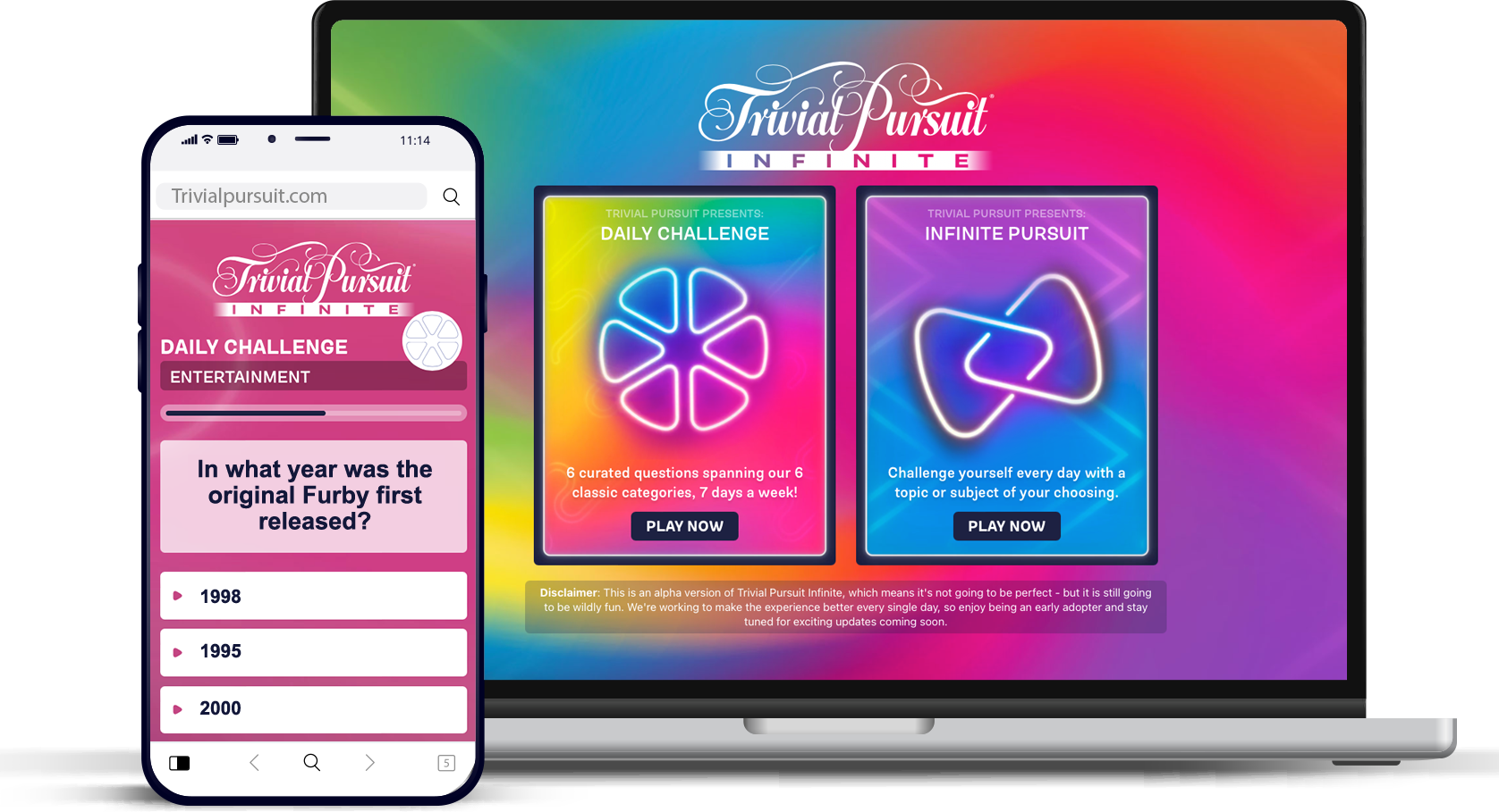
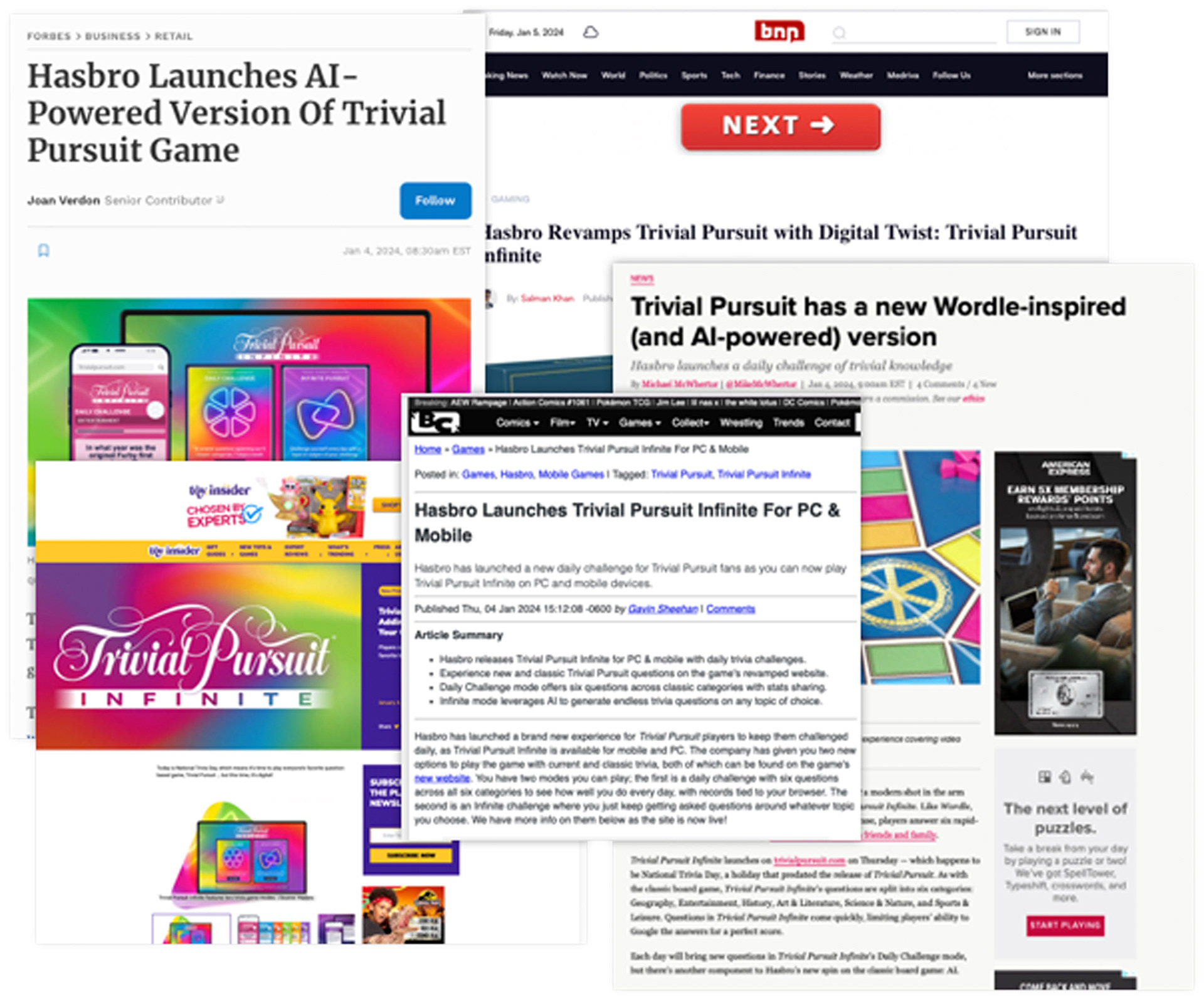
“I played a few days’ worth of Trivial Pursuit Infinite ahead of launch and found the interface speedy and simple to use, and my results easy to share with others. As Hasbro likely intends, playing a game sparked my interest in playing more Trivial Pursuit – and I wasn’t surprised to see a big button on my results screen that encouraged me to buy a physical copy.” – Polygon
View more work:
Sanibel Branding | Trivial Pursuit Case Study | Avalon Hill | Disney Villains | Hasbro Games Art Direction
PR Kits | Web Design |Fashion Doll Packaging | Event Design | Branding | Unneeded Co | SGPC | Logos
Sanibel Branding | Trivial Pursuit Case Study | Avalon Hill | Disney Villains | Hasbro Games Art Direction
PR Kits | Web Design |Fashion Doll Packaging | Event Design | Branding | Unneeded Co | SGPC | Logos